

What happens when the vibrant energy of pop art collides with the organic elegance of florals? The result is a captivating visual fiesta, where thick lines and even thicker saturation come together to form a floral pop painting that practically pulsates with life. But could the very elements that make these paintings so striking also pose a challenge to artists and admirers alike? Delving deep into this colorful conundrum, let’s explore the anatomy of a floral pop painting and unravel the secrets behind its bold aesthetics.
Bold Contours: The Structural Backbone of Floral Pop Art
At first glance, the defining attribute of a floral pop painting is its emphatic use of thick lines. These aren’t delicate strokes whispering through a canvas; they’re assertive contours that delineate petals, leaves, and stems with a graphic precision reminiscent of comic book art. This deliberate stylistic decision serves multiple purposes. Structurally, these bold outlines create a clear separation of elements, allowing each blossom to stand out as a discrete entity within a crowded composition. Visually, the thick lines lend an intriguing juxtaposition—they imbue the otherwise delicate subject of flowers with a striking robustness and a sense of dynamism.

These thick outlines also challenge traditional notions of floral representation, pushing viewers to reconsider the boundaries between natural softness and artistic stylization. Despite their cartoonish boldness, these lines command a sort of rhythmic dance across the canvas, guiding the eye fluidly from one bloom to the next.
Thicker Saturation: A Kaleidoscope of Vivid Hues
If thick lines are the skeleton of floral pop paintings, then saturation is undoubtedly the beating heart. The color choices in these works defy subtlety—they erupt in vivid, unapologetic intensity. Think alongside the palette of neon pinks, electric blues, and sun-drenched oranges that radiate from every petal. This saturation breathes a palpable sense of vitality into the floral forms, captivating and submerging viewers in an almost hallucinatory garden.

But achieving such saturation isn’t merely a matter of slapping on bright pigments. It requires meticulous layering and expert pigment blending to create depth while maintaining brilliance. The thicker applications of paint—often utilizing an impasto technique—add not just color intensity but tactile dimension, inviting the observer to explore the textural nuances up close.
Harmony in Contrast: Balancing Thick Lines and Saturated Hues
One might assume that combining thick, harsh outlines with the overwhelming vibrancy of saturated colors could result in visual chaos. However, the true mastery of floral pop paintings lies in striking a harmonious balance between these components. Rather than competing for attention, the thick lines and saturated hues complement each other, coalescing into a unified spectacle.
Artists navigate this delicate equilibrium through careful composition and color theory. Strategic placement of complementary colors enhances vibrancy without overwhelming the senses, while the black or dark-colored outlines provide the necessary containment, anchoring the explosive hues and preventing them from dissolving into visual confusion.
The Challenge of Capturing Organic Beauty Through Graphic Stylization
Herein lies the tantalizing challenge: how to maintain the essence of natural floral beauty while embracing the graphic rigidity of thick lines and saturation. Flowers are intrinsically delicate and nuanced, their fleeting beauty characterized by subtle gradients and ephemeral shadows. To render such softness using bold, unnatural techniques risks stripping away their inherent charm.
Yet, floral pop artists embrace this dichotomy, transmuting fragility into boldness. The result is not a literal reproduction of nature but rather an interpretation that embodies emotion, energy, and a contemporary edge. This artistic audacity invites observers to see flowers not only as botanical specimens but as symbols saturated with cultural vibrancy and modern exuberance.
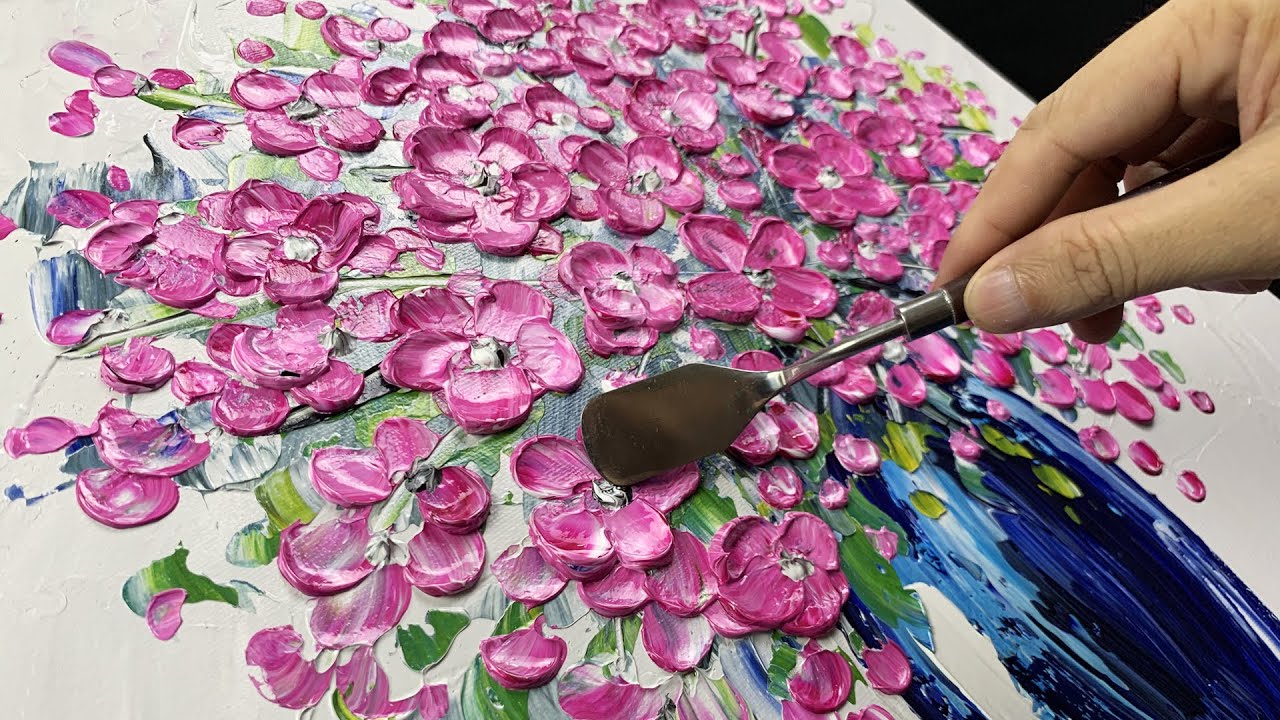
Techniques such as thick acrylic painting further underscore this transformation. By physically building up layers of texture, artists mimic the robustness suggested by their outlines and saturation, lending a palpable weight and presence to each floral form. This method requires patience and control—a challenge in itself—inviting artists to rethink their usual brushwork through a more sculptural lens.
Beyond Aesthetics: The Emotional Resonance of Floral Pop Paintings
While the anatomy of these paintings centers on visual elements, their true power transcends pure aesthetics. The intense colors and graphic lines evoke a spectrum of emotions—from joy and optimism to bold defiance against conventional art norms. There’s an infectious energy conveyed through the canvas that can uplift, energize, and inspire.
Moreover, these paintings often serve as cultural commentaries, blending the ephemeral beauty of nature with the longevity and reproducibility of pop art. They act as a bridge between tradition and modernity, inviting viewers to explore how floral motifs remain relevant and provocative in contemporary discourse.
Conclusion: Embracing the Vibrant Dichotomy
Dissecting the anatomy of a floral pop painting reveals a fascinating interplay between thick lines and thick saturation—a dichotomy that breathes life and audacity into the floral form. While the challenge of balancing graphic stylization with organic beauty remains ever-present, it is precisely this tension that makes such paintings so compelling and exhilarating.
In the end, these floral pop paintings don’t merely depict flowers—they celebrate them. They transform delicate petals into vivid statements, stitched together by unapologetic outlines and explosive colors that dare us to look closer, think deeper, and feel more intensely. The next time you encounter a floral pop painting bursting with thick strokes and richer-than-life hues, ask yourself: is it a challenge to the eye, or a joyful invitation into a world where art and nature collide spectacularly?


Leave a Comment