

The earth breathes in hues unseen by most, a silent symphony of ochres, umbers, and mossy greens that whisper of ancient forests and sun-baked canyons. These are not mere colors; they are the earth’s pulse, a chaoticist’s palette where chaos and harmony dance in the same breath. Meanwhile, the city hums with its own chromatic rebellion—neon veins pulsing through concrete arteries, a digital aurora that flickers like a thousand dying stars. Together, they form a visual dialectic: the organic and the synthetic, the timeless and the fleeting, all converging in a riot of pigment that defies categorization.
To understand this palette is to peer into the soul of two worlds colliding. The earth’s tones are not just colors; they are memories. They are the dust of forgotten civilizations, the patina of rusted iron, the slow burn of autumn leaves surrendering to winter. The city’s palette, by contrast, is a fever dream—electric blues that cut through the smog like surgical lasers, violent magentas that scream rebellion, and sickly greens that glow from the screens of devices we clutch like lifelines. This is the chaoticist’s dream: a world where every shade has a story, and every story is a rebellion against the monochrome.
The Earth’s Palette: Where Chaos Wears the Crown of Order
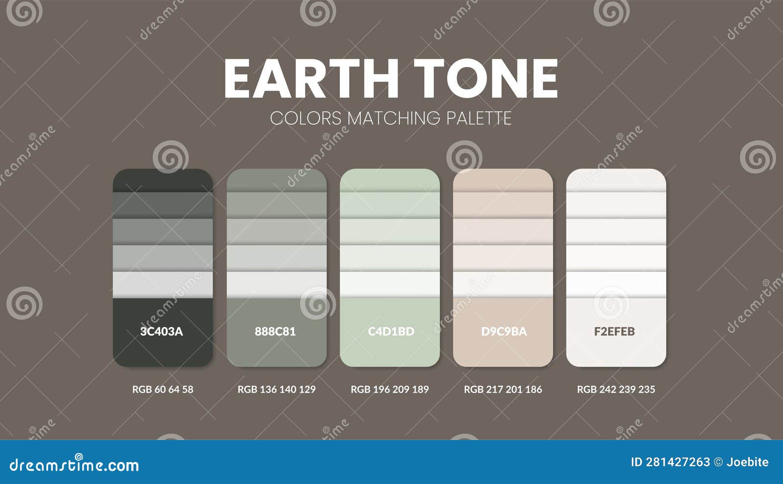
The earth’s colors are not for the faint of heart. They are the raw, unfiltered output of a planet that has spent millennia refining its aesthetic through fire, water, and the slow grind of tectonic plates. Take the umber, for instance—a color so deeply embedded in the earth’s crust that it feels like a geological secret. It is the color of shadows cast by ancient olive groves, of the soil that cradles the roots of forgotten trees, of the caves where early humans first daubed their dreams onto stone. Umber is not a color; it is a time capsule, a silent witness to the passage of eras.
Then there is ochre, the color of the desert’s breath. It is the hue of a lion’s mane at dusk, of the cliffs that guard the secrets of the Grand Canyon, of the clay pots that once held the first grains of civilization. Ochre is not just a color; it is a declaration of endurance. It survives where softer tones fade, a stubborn defiance against the erasure of time. And yet, it is not without its subtleties. The burnt sienna, a cousin to ochre, is the color of embers cooling in a hearth, of the first blush of a sunset over a parched landscape. It is warmth without sentimentality, a color that does not ask for love but commands respect.
But the earth’s palette is not limited to the warm. The slate greys and mossy teals are the colors of the world’s forgotten places—where moss clings to forgotten ruins, where the sea’s breath is trapped in the cracks of coastal cliffs. These are the colors of melancholy and mystery, the hues that haunt the edges of our vision when we stand at the threshold of a forest at twilight. They are the colors of introspection, of the quiet moments when the world feels vast and we feel small.
And then, there is the terracotta, the color of baked clay and sun-baked tiles. It is the color of Mediterranean villages clinging to hillsides, of the pots that once held wine and grain, of the earthenware that cradles the first flowers of spring. Terracotta is not just a color; it is a tactile experience. It invites touch. It smells of dust and sunlight. It is the color of home, even when home is thousands of miles away.
The City’s Palette: A Neon Psalm of Synthetic Rebellion
If the earth’s palette is a slow, deliberate exhalation, the city’s palette is a gasp—a sudden, electric inhalation of light and sound. It is the color of a world that has decided to rewrite the rules of nature. Here, cyberpunk pinks bleed into toxic greens, and acid yellows scream from the facades of buildings that never sleep. This is not a palette for the meek. It is for the dreamers who believe that the future should be loud, garish, and unapologetic.
Consider the neon cyan, a color so electric it feels like it could jump off the page and into your veins. It is the color of the screens that govern our lives, the glow of a smartphone in the dead of night, the hue of a city’s pulse when viewed from a skyscraper’s peak. Neon cyan is not a color; it is a drug. It is the color of addiction, of the endless scroll, of the dopamine hit that keeps us coming back for more. It is the color of the future, whether we like it or not.
Then there is the violent magenta, a shade so saturated it borders on the obscene. It is the color of a protest sign held high in a crowd, of a billboard advertising something we don’t need but will inevitably buy. Magenta is the color of rebellion, of the moment when a society decides it has had enough. It is the color of a riot in progress, of a heart breaking and mending all at once. It is not a color for the timid. It is for those who refuse to blend in.
The sickly lime green is another staple of the city’s palette—a color that feels both artificial and alive, like a plant that has been genetically modified to glow in the dark. It is the color of toxic waste, of abandoned factories, of the eerie glow of a computer screen in an empty room. Lime green is the color of decay masquerading as progress. It is the color of a world that has forgotten how to be gentle.
And then, there is the chrome silver, the color of a world polished to a mirror’s sheen. It is the color of skyscrapers that reflect the sky, of cars that gleam under the city lights, of the future as imagined by mid-century futurists. Chrome silver is not a color; it is a promise. It is the promise of a world where everything is clean, efficient, and devoid of imperfection. And yet, it is also the color of a world that is cold, sterile, and devoid of soul.

The Alchemy of Contrast: When Earth Meets City
The true magic happens when these two palettes collide—not in harmony, but in a glorious, chaotic clash. Imagine a rooftop garden in the heart of a metropolis, where terracotta pots overflow with mossy greens and ochre-hued succulents. The city’s neon glow bleeds into the edges of the scene, casting an unnatural light on the leaves, making them shimmer like they’ve been dipped in liquid metal. This is not a peaceful coexistence. It is a battle. A battle for dominance. A battle for the soul of the viewer.
Or consider the earthy taupe of a sidewalk crack, where weeds have forced their way through the concrete. The taupe is a reminder of the earth’s stubbornness, its refusal to be erased. And yet, it is framed by the city’s relentless march forward—the gray of the pavement, the white of the lines, the black of the sewer grates. The taupe is a relic. A ghost. A whisper of a world that once was.
In the hands of an artist, this contrast becomes a tool for storytelling. The earth’s palette can ground a scene, making the city’s excesses feel more human, more tangible. The city’s palette, in turn, can elevate the earth’s tones, making them feel futuristic, almost alien. Together, they create a visual language that is at once familiar and foreign, comforting and unsettling.
This is the chaoticist’s palette in action. It is not a palette for the passive observer. It is for those who see the world in layers, who understand that beauty is not found in uniformity but in the friction between opposites. It is for those who believe that the most compelling stories are written in the spaces between order and chaos, between the natural and the synthetic, between the past and the future.
The Psychology of the Palette: Why These Colors Move Us
Colors are not just visual stimuli; they are emotional triggers. The earth’s palette, with its warm ochres and cool mossy greens, is inherently calming. It is the color of a hug from an old friend, of a childhood memory of playing in the dirt, of the first sip of coffee on a rainy morning. These colors ground us. They remind us of our connection to the earth, to the cycles of life and death that have played out long before we arrived.
The city’s palette, on the other hand, is designed to disrupt. It is the color of a jolt of caffeine, of a sudden loud noise in a quiet room, of the adrenaline rush of standing on the edge of a cliff. These colors are not meant to soothe. They are meant to provoke. They are the colors of a world that is always moving, always changing, always demanding our attention.
When these two palettes are combined, the effect is electric. The earth’s tones provide a counterbalance to the city’s chaos, making the neon glow feel less overwhelming, less oppressive. At the same time, the city’s palette injects the earth’s tones with a sense of urgency, a reminder that even the most timeless things are subject to the relentless march of progress.
This psychological interplay is what makes the chaoticist’s palette so compelling. It is not just a collection of colors; it is a reflection of the human experience. It is the push and pull between our desire for stability and our need for change, between our love for the natural world and our fascination with the artificial one.

The chaoticist’s palette is a rebellion against the idea that beauty must be orderly or predictable. It is a celebration of the messy, the imperfect, the unrefined. It is a reminder that the world is not a single color, but a thousand shades of chaos, each one more vibrant than the last.
So the next time you find yourself standing at the intersection of a bustling city street and a quiet park, take a moment to observe the colors around you. Notice how the earth’s greens and browns soften the edges of the city’s neon glow. Notice how the city’s lights make the earth’s tones feel more alive, more electric. This is the chaoticist’s palette in action—a visual symphony where every note is a rebellion, every harmony a fleeting truce between two worlds that refuse to be silenced.
The earth breathes in hues unseen by most, and the city hums with its own chromatic rebellion. Together, they form a palette that is as complex as life itself—unpredictable, beautiful, and utterly unforgettable.


Leave a Comment