

Graphic design is a multifaceted discipline that goes beyond mere aesthetics; it encapsulates a blend of creativity and functionality. For those looking to delve into the realm of visual communication, understanding the fundamental principles of design is paramount. In this comprehensive guide, we will explore the core principles of graphic design that serve as the bedrock for captivating and effective visual compositions.
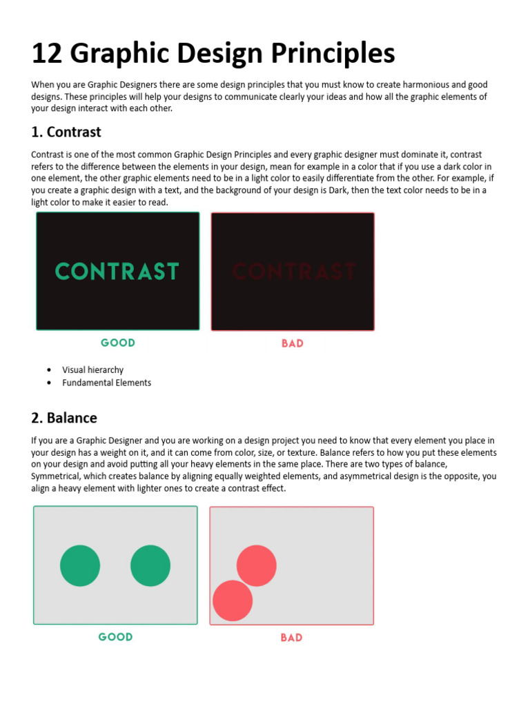
1. Balance: Harmonizing Elements
Balance is the equilibrium achieved through the distribution of visual weight in a composition. It can be categorized into two main types: symmetrical and asymmetrical. Symmetrical balance evokes a sense of formality and stability, while asymmetrical balance introduces dynamism and tension that can make a design more engaging. Achieving balance is crucial because it guides the viewer’s eye through the design seamlessly.
2. Contrast: Making Elements Stand Out
Contrast is the juxtaposition of differing elements to create visual interest and hierarchy. This principle employs variations in color, size, shape, and texture to distinguish between components in a design. For instance, using light text on a dark background enhances readability and draws attention to specific messages. Through strategic contrast, designers can easily direct viewer focus to the most critical elements of a composition.
3. Alignment: Creating Order
Alignment refers to the placement of elements in relation to each other and the overall canvas. It fosters a sense of organization that enhances the readability and coherence of a design. Proper alignment ensures that every piece contributes to the overall composition, creating a more harmonious visual experience. Whether elements are aligned along a grid system or centered around a focal point, thoughtful alignment can imbue designs with professionalism and clarity.
4. Repetition: Establishing Consistency
Repetition is the principle that advocates the consistency of design elements throughout a composition. This can involve the reiteration of colors, shapes, or fonts to create visual unity. A cohesive design becomes memorable, fostering brand recognition and establishing a clear visual identity. By echoing certain elements, a designer can reinforce key messages and enhance user experience.
5. Proximity: Grouping Related Elements
Proximity involves the spatial relationship between elements in a design. Grouping related items together visually communicates their connection and creates a sense of organization. This principle is essential for navigation within layouts, as it can dictate how users interpret information hierarchically. For example, placing a headline close to body text signals their relationship, aiding comprehension and overall readability.
6. Color Theory: The Language of Colors
Color theory is a cornerstone of graphic design that delves into the psychological and emotional meanings associated with colors. Understanding warm and cool colors, as well as complementary, analogous, and triadic color schemes, can significantly influence a design’s impact. Colors not only serve aesthetic purposes but also evoke emotions, trigger memories, and convey messages. A well-selected color palette helps establish mood and tone, enhancing viewer engagement.
7. Typography: The Art of Text
Typography transcends the mere selection of typefaces; it is about the visual representation of language. Skilled typographers understand how font styles, sizes, spacing, and line heights interact to create effective communication. The choice of typography can significantly alter the perception of a message. For example, serif fonts may project tradition and reliability, while sans-serif fonts convey modernity and simplicity. Proper typography enhances readability and strengthens the overall impact of the design.
8. White Space: Maximizing Breathing Room
Also known as negative space, white space is often underestimated, yet it is vital in graphic design. This principle involves the deliberate use of empty space to enhance clarity and focus. By allowing elements to breathe, designers avoid clutter and confusion, making compositions more digestible. White space can act as a powerful tool to emphasize critical content, guiding the viewer’s eye and enhancing the overall user experience.
9. Hierarchy: Structuring Information
Hierarchy is the visual organization of information that guides viewers through a composition in a deliberate order. By manipulating size, color, typography, and layout, designers can prioritize elements, highlighting the most important information. A strong hierarchy can effectively direct the viewer’s journey, ensuring that essential messages are not overlooked. This principle is especially critical in web design, where users skim content quickly and need guidance to locate key information.
10. Movement: Guiding the Viewer’s Eye
Movement refers to the technique of leading the viewer’s eye in a particular direction within a composition. This can be achieved through lines, shapes, and placement of elements. Movement creates a dynamic experience, encouraging interaction and engagement. By consciously designing pathways for the eye to follow, a designer can enhance storytelling within their work, keeping viewers invested in the narrative being presented.
Conclusion: Mastering the Basics of Design
Understanding and applying the principles of graphic design is essential for anyone embarking on a creative journey in this field. These ten foundational elements—balance, contrast, alignment, repetition, proximity, color theory, typography, white space, hierarchy, and movement—form the essential framework for producing captivating and effective designs. Embracing these principles will not only enhance one’s technical proficiency but also elevate the overall quality of visual communication. As designers harness these fundamentals, they unlock the potential to create compelling narratives and impactful messages through their work.


Leave a Comment