

Color is an extraordinary aspect of design; it’s not just a visual embellishment but an emotional catalyst that evokes responses and communicates messages. When embarking on the journey of selecting exceptional color palettes, one must delve deeper into the core principles of design. Let’s explore the art of choosing elegant color combinations and the fundamental principles that can transform ordinary visuals into striking works of art.
Understanding Color Theory
Before diving into the intricacies of color palettes, it is vital to grasp the foundational concepts of color theory. Composed of hues, saturations, and brightness levels, color theory lays the groundwork for how colors interact. The color wheel, a circular arrangement of colors, illustrates primary, secondary, and tertiary colors. A robust understanding of this wheel not only guides designers in choosing colors effectively but also enriches their creativity. Observations reveal that contrasting colors placed next to each other can create dynamic visual tension, while analogous colors foster harmony. This duality invites designers to contemplate the emotional undercurrents each color instills.
The Emotional Language of Color
Colors convey a myriad of emotional responses, often beyond mere perception. Red can evoke passion or urgency, while blue may inspire tranquility and trust. Designers should consider not only their intent but also their target audience’s cultural and personal associations with colors. For instance, green signifies growth and renewal in various cultures but can symbolize envy in others. Understanding this emotional lexicon allows designers to craft narratives through their color choices, resonating more profoundly with viewers.
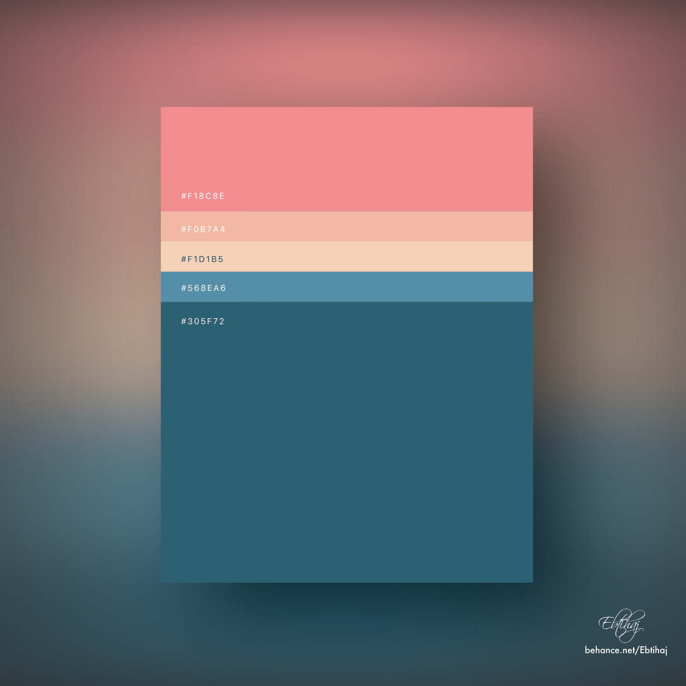
Establishing a Color Palette: The Process
Crafting a spectacular color palette is not a mere act of picking favored shades. It requires meticulous planning and reflection. Here’s a streamlined process to achieve stunning visuals through effective color selection:
- Research and Inspiration: Inspiration can spring from various sources—nature, art, or even everyday occurrences. Gather images, materials, and palettes from your surroundings and online platforms to cultivate an idea bank.
- Defining Purpose: Every design has a purpose. Identifying the message you want to communicate will inform your color choices. If creating for a wellness brand, calming colors like greens and soft blues may be appropriate.
- Using Color Models: Experiment with various color models such as RGB, CMYK, or HSL. They each offer different benefits depending on the medium—digital displays or print. Knowing your medium will guide your palette formulation.
- Selecting Primary Colors: Choose a primary color that embodies your themes and values. This color will anchor your palette and set the emotional tone.
- Building a Complementary Palette: Utilize the color wheel to find complementary colors that can either create harmony or contrast. A primary hue can be coupled with its complementary color for striking visual effects.
- Testing and Iteration: Experiment with the chosen colors in different contexts. Use mockups to see how the palette functions across various applications. This iterative process is vital for refining your choices.
The Role of Contrast and Balance
Contrast is a potent tool in design. It elevates visuals by creating focal points and guiding the viewer’s eye. Whether through complementary colors or light vs. dark shades, contrast aids in establishing hierarchy within designs. Conversely, balance ensures that no single element overshadows the other; achieving equilibrium among colors allows for a cohesive and aesthetically pleasing composition. An imbalance might distract viewers or render the design inexplicable at first glance.
The Significance of Neutrals
While it’s easy to get lost in vibrant hues, neutrals play a pivotal role in grounding a design. Colors such as whites, grays, blacks, and browns offer respite from bold color choices and enhance the overall palette. They serve as a canvas that highlights accent colors while delivering sophistication and elegance. Neutrals can also adjust the mood of the design; a stark white can evoke a sense of modernity, while a deep brown may suggest warmth and tradition.
Creating Cohesion With Monochromatic Schemes
A monochromatic color scheme employs variations of a single hue—differing saturations, tints, and shades. This approach not only cultivates simplicity and elegance but also showcases depth within a singular color’s spectrum. Monochromatic palettes can evoke a serene atmosphere, often ideal for minimalist designs. However, they require careful attention to contrast to maintain visual interest and prevent monotony.
Incorporating Trends Responsibly
Design trends can provide a wealth of inspiration. However, reliance on fleeting trends can undermine the timeless quality of your work. While it can be thrilling to incorporate the ‘color of the year,’ designers should temper their enthusiasm with a fundamental understanding of what resonates with their audience. The goal is to ensure that the color choices serve the project’s integrity rather than the transitory nature of trends.
Conclusion
Choosing an impactful color palette is more nuanced than selecting appealing colors. It is an intersection of emotion, purpose, theory, and sensibility. As designers, embracing the principles of color theory, understanding emotional responses, and adhering to the fundamentals of design will yield visually spectacular results. The art of color selection is a potent force, capable of creating metaphoric bridges between the creator and the audience. As such, wield it wisely to transcend mere visuals and evoke profound connections.


Leave a Comment