

Creating a color palette that exudes professionalism while also encapsulating your unique artistic voice can be a daunting endeavor. Have you ever stood in front of a blank design project, grappling with how to harmoniously merge hues and shades? The process may seem overwhelming, but understanding the fundamental principles of design can transform your approach to color. This article will guide you through the labyrinth of color theory, ensuring your color palette not only captivates but also communicates effectively.
At the outset, it is essential to grasp that colors evoke emotions. They create visceral reactions that can significantly influence the viewer’s perception of your design. Each color possesses its unique psychological traits. For example, blue often embodies tranquility, while red can evoke passion and urgency. As you embark on your journey of color selection, it is paramount to consider the message you wish to convey and the feelings you want to evoke in your audience.
The first pivotal step in curating your color palette is to understand the color wheel. This circular diagram arranges the spectrum of colors in a systematic way, showcasing primary, secondary, and tertiary hues. Primary colors—red, blue, and yellow—are the building blocks from which all other colors are derived. Secondary colors, like green, orange, and purple, emerge from mixing two primary colors. Tertiary colors result from blending a primary color with a secondary one, yielding a rich array of shades.
Once you familiarize yourself with the color wheel, the next challenge is to choose a color scheme that resonates with your project’s theme. Here are some common color schemes to consider:
- Monochromatic: This scheme utilizes variations in lightness and saturation of a single color. It provides a cohesive and harmonious effect, making it ideal for minimalist designs.
- Analogous: Comprising colors that sit next to each other on the color wheel, this scheme offers a serene and comfortable palette. It can introduce subtle variations while maintaining visual cohesion.
- Complementary: This scheme involves pairing colors that are directly opposite each other on the color wheel. The vibrant contrast created can evoke a sense of energy and excitement, but it requires careful balancing to avoid overwhelming the viewer.
- Triadic: By selecting three colors that are evenly spaced around the color wheel, this scheme achieves a balanced yet dynamic palette. It’s vibrant and often used to produce playful designs.
As you explore these schemes, it’s important to remember that less is often more. While it may be tempting to incorporate a plethora of colors, focusing on a limited palette can lead to professionalism. Generally, a main color, a secondary color, and an accent color will suffice to create a sophisticated design.
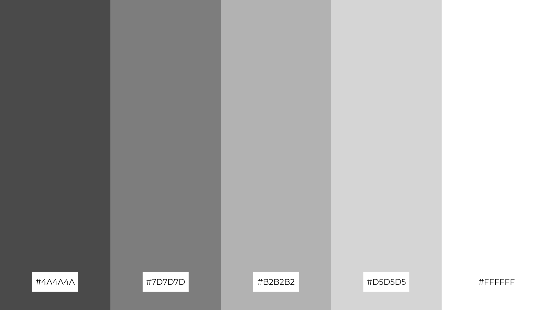
After narrowing down your color scheme, examine the importance of contrast within your palette. Contrast not only enhances legibility but also ensures that crucial elements of your design stand out. For instance, if your background is dark, using lighter text can create a striking visual difference, guiding the viewer’s eye where it needs to go. High contrast can revitalize a dull design, adding depth and dimension.
Contrast, however, isn’t solely about hue; it also encompasses saturation and value. Saturation refers to intensity; highly saturated colors are vivid and eye-catching, while desaturated hues can impart a softer vibe. Consider the overall mood you wish to create and adjust accordingly, balancing both vibrant and muted colors for a dynamic presentation.
The allure of texture cannot be dismissed either. A flat surface can be enriched by overlaying colors with varied textures. Whether through patterns, gradients, or images, introducing texture can break the monotony of a color scheme, adding layers of interest and intrigue to your design. Moreover, the interplay of colors and textures can elevate your visual storytelling, allowing you to forge a deeper connection with your audience.
Another crucial consideration is lighting. The perception of color changes dramatically under different lighting conditions. What appears vibrant in daylight may look subdued under artificial light. Thus, testing your color palette in various environments is essential to ensure it maintains its integrity across different mediums. Remember—what works on a digital screen might not have the same effect in print, so experiment until you find a harmonious balance.
To solidify your newfound color palette, utilize various tools at your disposal. Online platforms enable you to generate palettes, allowing you to visualize your selections. Tools like Adobe Color, Coolors, and Paletton can aid in crafting your ideal combination with ease. These resources also offer inspirations based on current trends and popular choices in the design realm.
Moreover, seek feedback. Sharing your designs with peers can provide valuable insights and perspectives that might escape your notice. Often, fresh eyes can catch inconsistencies or provide suggestions for enhancement that elevate your work in unforeseen ways.
Ultimately, the pursuit of a professional color palette demands patience, creativity, and a willingness to experiment. Embrace the challenge of color, and remember that the journey is as enriching as the destination. With practice, each brushstroke or pixel can harmonize in a symphony of colors that not only beautifies but also speaks volumes about your artistic narrative.
In conclusion, the world of color palettes brimming with potential awaits. By following the principles of design and applying the insights shared here, you can craft a simple yet professional color palette that resonates with excellence. So, are you ready to dive into the fascinating universe of color and unleash your creative prowess?


Leave a Comment