

In the vibrant tapestry of creativity, the principles of design stand as the foundational threads that weave coherence and allure into the fabric of visual communication. Each principle operates as a compass, guiding the artistic voyager through the labyrinth of aesthetic possibilities. This exploration unravels the intricacies of crucial design principles, illuminating their significance with vivid examples to inspire and inform.
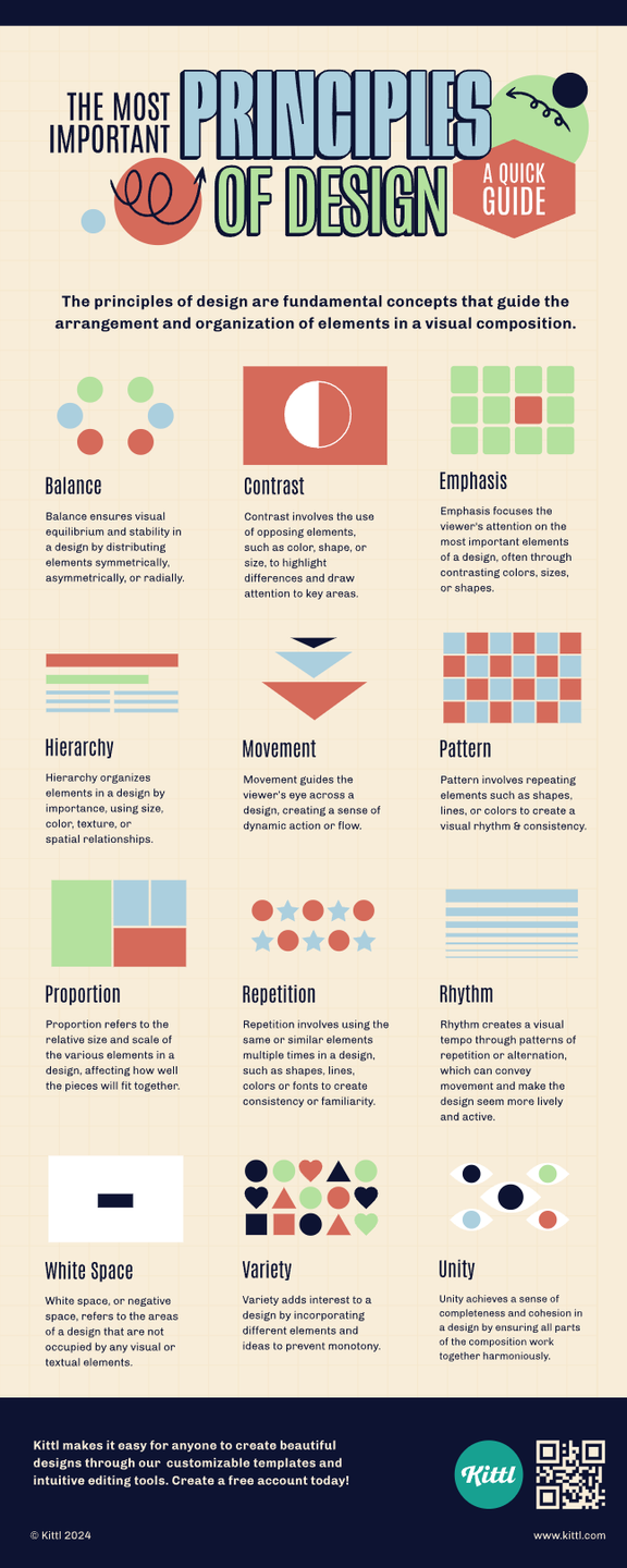
1. **Balance: The Equilibrium of Elements**
Balance in design mirrors the equilibrium found in nature, akin to a perfectly laden scale. It involves distributing visual weight within a composition so that no single element overwhelms the others. There are two predominant types of balance: symmetrical and asymmetrical. Symmetrical balance is rooted in uniformity, where elements on either side of a central axis mirror one another. Think of the resolved mirror image of a still lake, reflecting trees with flawless precision.
Conversely, asymmetrical balance engages a more dynamic interaction, like two dancers in a duet, where different forms complement one another to create a sense of harmony. Consider a poster that juxtaposes a heavy, dark graphic on one side with lighter text on the other—both attract the viewer’s gaze without overshadowing.
2. **Contrast: The Dance of Disparity**
Contrast is the spark that ignites interest; it highlights differences among elements that can enhance their visibility and meaning. This principle transforms the mundane into the extraordinary through juxtaposition—be it in color, shape, size, or texture. An illustration of contrast might be a vintage poster showcasing bold, black typography against a decaying, pastel background, creating an arresting visual dialogue that commands attention.
By engaging stark contrasts, designers can evoke emotions, delineate sections, or emphasize particular parts of a composition. The vibrant hues of a tropical sunset splashed beside the muted tones of twilight create an emotional interplay, illustrating how contrast can articulate a narrative.
3. **Emphasis: The Art of Attraction**
Every composition has a focal point, a beacon that captures a viewer’s attention amidst the cacophony of visual stimuli. Emphasis directs the eye towards the intended message, much like a spotlight illuminating a lone performer on stage. Various techniques may accomplish emphasis—contrast, placement, size, and color saturation all serve as instruments in this orchestra of attraction.
In a marketing campaign, a large, bold headline against a minimalist background creates immediate emphasis, effectively guiding the viewer’s focus. Emphasis inspires curiosity, encouraging deeper exploration into the design’s layers.
4. **Movement: The Journey Through Space**
Movement generates the illusion of action; it propels the viewer’s gaze from one aspect of a design to another, akin to a river flowing through the landscape of perception. This principle can be achieved through the strategic placement of elements—lines, shapes, and colors can suggest pathways for the eye to travel.
Think of an infographic where arrows direct attention along a timeline. Each element leads the viewer through the narrative, transforming a static image into a dynamic story. The artful rhythm established by movement not only sustains interest but also allows for fluid comprehension.
5. **Pattern: The Repetition of Harmony**
Pattern enriches design by creating visual rhythms through repetition. This principle conjures feelings of unity and consistency, reflecting the natural sequences seen in flora and fauna. A patterned textile, for example, can evoke comfort and familiarity, while a grid layout enhances navigability in digital interfaces.
Consider the intricate designs on Moroccan tiles, repeating geometrical shapes that offer both visual allure and cultural resonance. These patterns pull viewers in, inviting them to explore further within the comfort of recognizable structures.
6. **Repetition: The Echo of Ideas**
Repetition serves as a declarative tool, reinforcing ideas and themes in a composition. By repeating visual elements—whether colors, shapes, or patterns—designers cultivate familiarity. This method establishes cohesion, much like a refrain in music that binds a melody together.
An advertising piece using the same color palette across its visuals for brand consistency exemplifies effective repetition. The viewer, encountering a harmonious recurrence of images, begins to weave a narrative that elevates brand recognition.
7. **Alignment: The Unseen Ties That Bind**
Alignment structures design by anchoring elements in relation to one another, ensuring that the viewer perceives order in the arrangement. This principle creates a sense of connection and coherence, much like the interlocking branches of trees forming a natural archway. Effective alignment—whether centered, left-aligned, or justified—impacts the visual flow, enhancing readability and engagement.
In web design, a thoughtfully laid out grid ensures that text and images form a harmonious whole, allowing information to be absorbed effortlessly. The micro-movements within alignment guide the user experience while connecting disparate pieces into a unified narrative tapestry.
8. **White Space: The Breathing Room of Design**
White space, often dismissed as mere emptiness, is the silent partner in design. It provides necessary breathing room, allowing elements to stand boldly without overwhelming the viewer. Much like the silence between notes in a symphony, white space enhances the impact of visual elements, facilitating focus and comprehension.
A minimalist poster design, abundant in white space, allows the essential message to resonate, defining space and creating contrast with the graphical elements. A judicious use of white space not only elevates aesthetics but also encourages a thoughtful engagement from the viewer.
Collectively, these principles of design form an intricate roadmap for every aspiring artist and seasoned designer. They offer a robust framework that empowers individuals to navigate the complex landscape of visual communication. By embracing and mastering these principles, one embarks on a journey to extract the quintessence of creativity, translating mere ideas into compelling visuals that ignite the imagination.


Leave a Comment