

The world of design is rich with colors, forms, and arrangements that evoke emotion and convey meaning. At the heart of cohesive design lies the interplay of color schemes, influenced by fundamental principles that dictate how colors interact and how they are perceived by the viewer. Understanding these principles not only elevates aesthetic appeal but also harnesses the psychological impact of colors. This exploration will delve into the principles of design related to color schemes, elucidating what makes a color scheme visually appealing while considering the underlying psychology.
Understanding Color Theory
Before diving into design principles, it is essential to grasp the underlying color theory. At its core, color theory is a set of guidelines that explains how colors relate to each other. It encompasses the color wheel, which showcases primary, secondary, and tertiary colors. The juxtapositions and harmonies formed within this wheel become foundational in developing effective color schemes. The primary colors—red, blue, and yellow—serve as the building blocks for creativity. Secondary colors, obtained by mixing these primaries, further expand the palette. Lastly, tertiary colors embrace the nuances that engage viewers on a deeper level.
The Role of Color Harmony
Color harmony is a crucial principle that orchestrates the relationship between different shades, creating a visually pleasing configuration. Harmony can be achieved through several color schemes:
- Complementary Color Schemes: Utilizing colors opposite each other on the color wheel—such as blue and orange—creates a vibrant contrast. This dynamic interplay captures attention, commanding focus while ensuring balance.
- Analogous Color Schemes: Comprising colors that sit adjacent on the color wheel, like green, blue-green, and blue, analogous schemes achieve a tranquil aesthetic. They evoke a sense of comfort and cohesiveness, often seen in nature.
- Triadic Color Schemes: This scheme employs three colors equidistant on the color wheel, such as red, yellow, and blue. The vibrancy derived from a triadic palette yields diversity and energy, invigorating the design.
Each of these schemes conveys a distinct mood and narrative, offering designers the tools to evoke specific feelings through color.
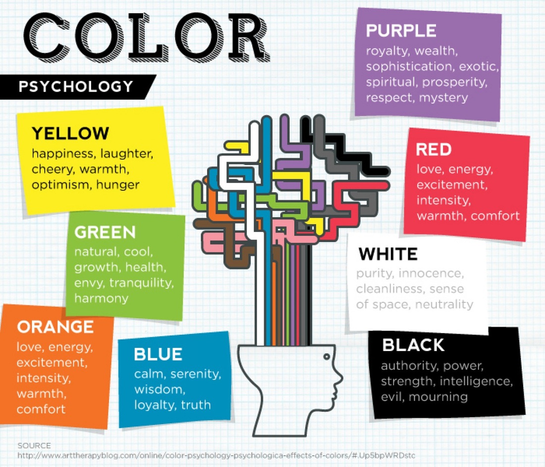
The Psychology of Color
Exploring the psychological nuances associated with colors can profoundly affect design effectiveness. Colors hold significant value beyond mere aesthetics; they weave narratives and embody emotions.
- Red: This bold hue conveys passion, urgency, and excitement, making it popular in branding aimed at impulsive behaviors.
- Blue: Phycologically serene, blue instills trust and calmness. It’s often employed in corporate settings to foster reliability.
- Yellow: Bright and cheerful, yellow represents optimism and energy. However, when overused, it can become overwhelming.
- Green: Associated with nature and tranquility, green implies growth and renewal, making it a favorite in wellness industries.
These color associations can be harnessed in design to strengthen the message being communicated, directly impacting viewer reception and emotional response.
Contrast and Balance
Contrast is a vital principle in any design, helping to distinguish elements and guide the viewer’s eye. Establishing contrast through color can make certain aspects of a design stand out significantly. For instance, dark text on a light background enhances readability while vibrant colors amid subdued tones can draw attention to focal points.
On the other hand, balance ensures that no single aspect of a design overwhelms the others. This equilibrium can be achieved through symmetrical or asymmetrical arrangements. Symmetrical balance relies on mirroring elements across a central axis, cultivating a sense of order and stability. Asymmetrical balance, however, is more dynamic and invigorating, balancing differing elements through visual weight, often achieved by varying colors and shapes.
Contextual Considerations
The effectiveness of a color scheme can vastly depend on its context. Cultural perceptions of color vary widely; for example, while white is synonymous with purity in some societies, it may represent mourning in others. Designer awareness of cultural sensitivities is vital in creating universally relatable designs. Furthermore, the context of the space—be it an online platform or physical environment—determines how colors are perceived. A color that feels intimate in a small room may invoke confinement in a larger space.
Trends and Innovations in Color Design
While classic principles of color theory and psychology remain relevant, modern design continually evolves. Trends evolve, influenced by societal changes and technological advancements. Current digital tools allow designers to experiment with hues in unprecedented ways. Gradients, for example, have made a strong resurgence, allowing for smooth transitions across colors. This fluidity captures contemporary audiences, offering a fresh aesthetic that resonates with movement and dynamism.
The Importance of Testing and Iteration
No design is complete without thoughtful testing. Feedback mechanisms, like user testing or A/B testing for web designs, facilitate insights into how chosen colors resonate with the target audience. This iterative process allows designers to refine and recalibrate their color schemes, ensuring alignment with user preferences and emotional engagements.
Ultimately, the art of color schemes encapsulates a rich tapestry of knowledge, bridging aesthetics with psychology. By adhering to principles of design and recognizing the profound implications of color psychology, designers can forge compelling visual narratives that enrich the viewer’s experience and evoke desired responses. As we continue to explore the intricacies of color in design, it remains evident that the right choice in a color scheme not only enhances beauty but also amplifies meaning, creating a lasting impact in the realm of art and design.


Leave a Comment