

In the enchanting realm of logo design, the concept of negative space emerges as a powerful tool in the designer’s arsenal. This intriguing principle not only invites creativity but also demands a profound understanding of visual perception. The very essence of negative space transcends mere aesthetics; it is an invitation for a deeper connection with the audience, a narrative woven between forms that compels viewers to look beyond the obvious. This article delves into the myriad dimensions of negative space in logo design, exploring its meaning, benefits, and showcasing some illustrious examples that have transcended the ordinary.
The Meaning of Negative Space
Negative space refers to the area surrounding and between the subjects of an image. Contrary to the traditional view of design that emphasizes the subject or positive space, negative space relies on the interplay of absence and presence. It is what is left unoccupied that often becomes equally significant, if not more so, than the elements that fill the frame. This principle hails from the fundamental tenet of design: every element on a canvas has a counterpart that shapes its context. Think of negative space as the silent partner in a conversation, offering a rich tapestry of meaning through its mere existence.
In the world of logo design, negative space can craft narratives quietly yet powerfully. It ingeniously forms shapes and symbols that may elude the casual observer but reveal their ingenuity upon closer examination. This captivating duality piques curiosity, beckoning audiences to engage and discover layers of meaning nestled within the design.
The Benefits of Utilizing Negative Space
Embracing negative space in logo design yields numerous benefits that can elevate a brand’s identity and convey a stronger message. Here are some key advantages:
- Enhanced Memorability: Logos that cleverly incorporate negative space often leave a lasting impression. The element of surprise created by hidden shapes encourages viewers to remember the brand, effectively cementing it in their minds.
- Encouraged Engagement: Audiences are drawn to logos that challenge their perceptions. By requiring a moment of contemplation, brands utilizing negative space foster a deeper emotional connection with their audience.
- Simplified Communication: Complex messages can be distilled into simple forms through negative space. It allows designers to convey multifaceted ideas in a straightforward manner, facilitating quick recognition and understanding.
- Timeless Quality: Negative space designs often exude a sense of elegance and sophistication, rendering them less susceptible to the whims of fleeting trends. This timeless quality ensures longevity in a world that constantly craves the new.
- Adaptability: Logos that utilize negative space are typically versatile. They can be seamlessly adapted across various mediums, whether it be digital, print, or merchandise, without losing their inherent meaning.
Famous Examples of Negative Space in Logo Design
The success of negative space lies in its ability to create meaningful designs that resonate with audiences. Many iconic brands have deftly employed this technique to carve out their identities. Here’s an exploration of a few noteworthy examples:
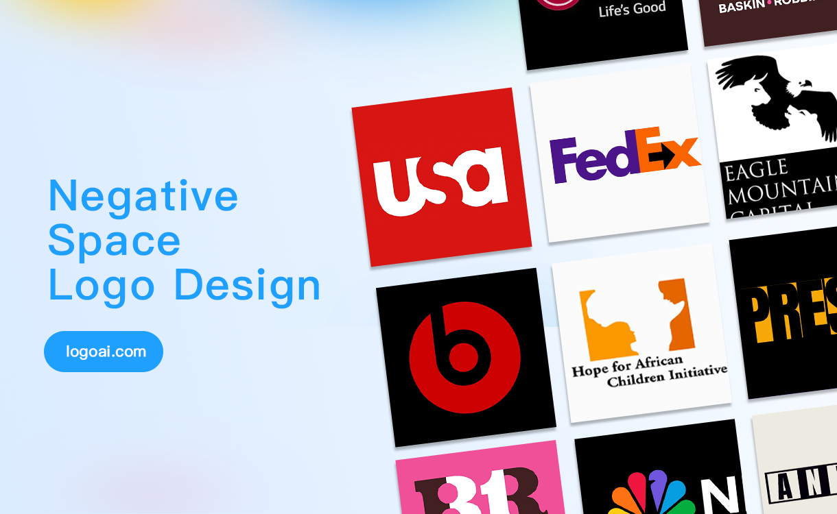
- FedEx: Perhaps one of the most acclaimed examples of negative space is the FedEx logo, which conceals an arrow between the “E” and the “x.” This subtle yet powerful element signifies speed and precision, resonating deeply with the brand’s core values.
- Woolmark: The Woolmark logo showcases the fluidity of negative space to depict a stylized wool symbol. The design achieves a perfect balance between elegance and simplicity, inviting viewers to perceive the abstract representation of the fiber without overwhelming details.
- Toblerone: A delightful surprise lies within the Toblerone logo, where the silhouette of a bear—symbolic of its Swiss roots—can be discerned amidst the mountain. This clever integration invites the viewer to make a connection between the product and its geographic origin.
- London Symphony Orchestra: The logo for the London Symphony Orchestra consists of carefully arranged negative space that evokes musical notes. It creatively infers the identity of the organization while maintaining sophistication, inviting music lovers to associate the visual with the auditory experience.
- Amazon: The Amazon logo cleverly uses negative space to create a smile through the curved arrow connecting the letters “A” to “Z,” indicating the company’s vast range of products—from A to Z. This design not only conveys a welcoming tone but also emphasizes customer satisfaction.
Redefining Perspectives on Logo Design
By understanding the intricacies of negative space, designers can shift their perspectives and reconsider conventional design practices. The principle of negative space implores one to look beyond the obvious, to seek meaning where none immediately presents itself. This paradigm shift encourages a holistic approach to artistry, necessitating a foundational awareness of balance, harmony, and the dynamic interplay between elements in a design.
As the world of logo design continues to evolve, the allure of negative space remains undiminished. Embracing its potential not only enhances a brand’s visual identity but also fosters an emotional bridge with the audience. By crafting symbols that entice curiosity and inspire engagement, designers can conjure a relationship that extends beyond a mere logo; it becomes a story told through shadows and light, absence and presence.
In conclusion, negative space serves as a testament to the profundity of design. It challenges both designer and viewer to engage in a dialogue that transcends the superficial, revealing layers of complexity that lie just beneath the surface. The next time you encounter a logo, take a moment to explore its negative space—a hidden world of creativity may await your discovery.


Leave a Comment