

In the realm of design, the successful application of color is paramount to achieving visual harmony. The intricate balance of hues can influence emotions, provoke thought, and convey messages beyond the written word. This article delves into the art fundamentals of color theory and design principles, exploring how to create a harmonious visual experience by expertly balancing colors.
The fascination with color stems from its profound psychological impact. Colors are not merely aesthetic choices; they are imbued with meaning and are capable of stirring emotions. For instance, warm shades like red and orange can elicit feelings of passion or urgency, while cooler tones such as blue and green often evoke tranquility and serenity. This intrinsic connection between color and emotion forms the foundation upon which many designers craft their palettes. Understanding this relationship can enhance the visual narrative of a design.
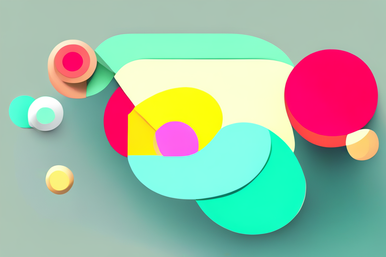
Balance is a cornerstone principle of design that advocates for visual equilibrium. In the context of color, achieving balance means strategically distributing colors across a composition to create a unified whole. A well-balanced color scheme will captivate viewers, providing a sense of order amidst the chaos. Designers often employ a myriad of techniques to achieve this equilibrium, including the use of complementary colors, analogous colors, and triadic color schemes.
Complementary colors are those that sit opposite each other on the color wheel. The dynamic contrast between pairs such as red and green or blue and orange can produce an energizing balance. When used judiciously, complementary colors can draw the eye toward focal points in a design, creating a vibrant and engaging composition. Designers must be cautious, however, as overuse of complementary colors can lead to visual discord. Therefore, it is crucial to temper bold contrasts with neutral tones that can help anchor the viewer’s eye.
In contrast, analogous colors—those that sit adjacent on the color wheel—offer a more subtle approach to balance through color harmony. These hues blend seamlessly, fostering a cohesive kinship visually. For example, a palette of yellows, greens, and blues can evoke the tranquility of nature, creating a serene and inviting atmosphere. This method allows for the exploration of variations in saturation and brightness within related hues, enabling rich and multifaceted designs without overwhelming the observer. By leveraging analogs, designers can create depth without sacrificing visual unity.
The triadic color scheme introduces another layer of complexity and balance. By selecting three colors that are equidistant on the color wheel, designers can foster vibrancy while maintaining equilibrium. For example, the trio of red, yellow, and blue provides a classic palette rife with potential. This strategy, when executed with skill, can infuse designs with energy and dynamism. However, utilizing a triadic scheme requires caution; equal distribution of each color can lead to a chaotic visual experience. Instead, designers may opt to assign one color as a dominant hue while using the others as accents, ensuring balanced engagement without overpowering the viewer.
Furthermore, the concept of color temperature plays a vital role in balancing a design. Color temperature categorizes hues into warm and cool; warm colors tend to advance, while cool colors recede. A well-balanced design leverages both types, ensuring that no single temperature overwhelms the other. A harmonious blend of warm tones can create inviting focal points, while cool tones can recede into the background, establishing depth. Designers are tasked with carefully considering how the interplay of warm and cool hues affects the overall perspective and balance.
In addition to individual color relationships, the principle of contrast must not be overlooked. High contrast ensures that elements stand out, drawing attention where needed. This principle can be particularly effective when pairing dark and light colors, allowing for a tactile visual experience that guides the eye fluidly through a design. Yet, conflicting contrasts can splinter focus, leading to a disjointed presentation. The goal is to achieve harmony within diverse elements, allowing for contrast without resulting in chaos.
Moreover, the psychological implications of particular colors should inform the decision-making process. Cultural associations, personal experiences, and environmental influences shape color perception significantly. Hence, a color that evokes a sense of calm in one person might elicit a sense of ire in another. Understanding the audience and context is crucial for designers when selecting color schemes that will resonate effectively.
Another critical consideration is the scale and proportion of color usage within a design. The larger a color appears in a composition, the greater its impact. Dominant colors draw the eye, while smaller accent colors provide intrigue. Thus, establishing a hierarchy of color can effectively guide a viewer’s journey throughout the design. Employing a strategic balance of colors not only fosters visual appeal but also resonates emotionally with the audience.
In conclusion, mastering the balance of color in design is a multifaceted endeavor that requires an understanding of color theory, principles of balance, and the psychological effects of hues. As designers navigate the complexities of color relationships—be it through complementary, analogous, or triadic schemes—their ability to create a harmonious composition hinges on meticulous consideration of these elements. True visual harmony emerges when color is thoughtfully balanced, fostering not only aesthetic pleasure but also a deeper emotional connection with the audience. The world of design is an ongoing dialogue with color, and every palette tells a unique story.


Leave a Comment