
In the vast landscape of design, the principles of art serve as the cardinal compass, guiding creators through the nebulous realms of creativity and innovation. Just as an artist employs brushstrokes and color palettes to evoke emotion, UI/UX designers harness these guiding tenets to enhance user engagement and elevate digital experiences. This comprehensive examination delves into fundamental design principles—harmonizing form with functionality to craft intuitive, aesthetically pleasing interfaces.
The Canvas: Understanding Space and Layout
Every exceptional design begins with a blank canvas, the space where ideas burgeon. Layout serves as the scaffolding of a digital interface, framing each element and guiding the user’s eye through the experience. The concept of white space—or negative space—acts as the unsung hero in design, often revered for its ability to enable readability and foster an air of sophistication. Just as silence punctuates a symphony, effective use of white space allows the critical elements of a design to resonate more profoundly.
Moreover, understanding the grid system is akin to establishing a private language between the designer and the user. A structured grid provides a reliable framework that harmonizes disparate elements, evoking balance and cohesion. This meticulous organization imparts an innate sense of direction, transforming a pixelated jungle into a navigable wonderland.
The Color Palette: Emotional Resonance Through Hue
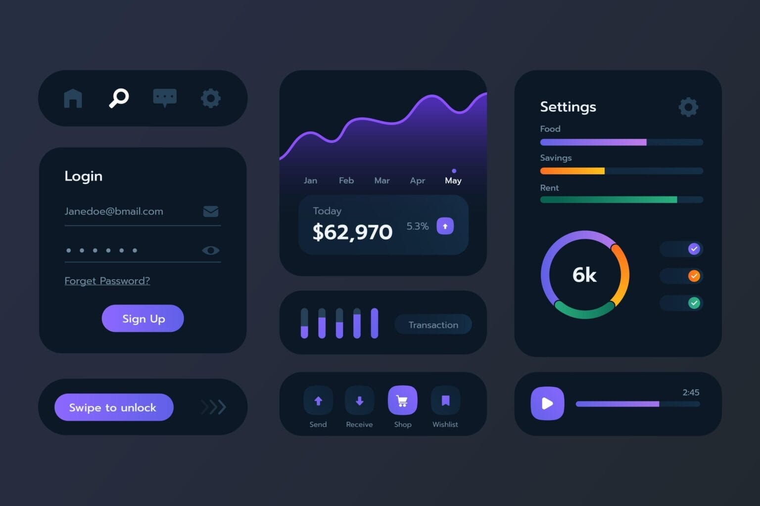
Color, often referred to as the language of emotions, can drastically affect user perceptions and interactions. Each shade, from the mellow tones of pastels to the vibrant intensity of primaries, holds the power to invoke specific feelings and responses. The psychological implications of color are paramount—consider how a warm red may stimulate appetite, while serene blues encourage tranquility and trust.
An effective color palette should not merely be aesthetically pleasing but also coherent and purposeful. Designers intertwine hues with their brand narratives, cultivating an atmosphere that invites users to dwell in their digital space. Curating complementary colors can serve to underline important elements, guiding users to pivotal actions and enhancing their overall experience.
Typography: The Art of Conveying Tone
Typography, often underestimated, plays a crucial role in design, acting as the voice of the written word. The selection of typeface sets the mood, establishes hierarchy, and ensures clarity. Just as an actor embodies a character, so too does a typeface lend personality to content.
Choosing the right font reflects the essence of a brand. A sleek sans-serif evokes modernity and minimalism, whereas an ornate serif might connote tradition and elegance. Typographic hierarchy, through size and weight variations, allows designers to delineate sections of content, ensuring that key messages are accentuated and flow naturally from one idea to another. Readers should navigate through text like a well-trodden path through a lush forest, each word an essential step toward understanding.
Contrast: The Dance of Opposites
Contrast is the dynamic interplay of light and dark, softness and hardness; it serves as a crucial element, adding depth and excitement to designs. It transforms monotony into visual interest, stimulating attention. Applying contrast effectively can highlight important features, drawing the user’s eye toward calls to action or essential information.
Moreover, contrast can also manifest in thematic elements. Mixing various textures—like smooth icons juxtaposed against gritty backgrounds—can evoke an engaging multidimensional experience, effectively entrancing the user. Through this dramatic interaction, the design becomes a lively conversation, urging the user to explore further.
Alignment: The Invisible Thread
Alignment is the invisible thread that stitches together disparate design elements into a coherent whole. It fosters organization and clarity, ensuring that the user’s journey is intuitively guided rather than chaotically erratic. Effective alignment is the subtle force behind a polished aesthetic, transforming ordinary presentations into striking visuals.
When elements are deliberately aligned, they convey a sense of order and professionalism, instilling confidence in the user. Misalignment, conversely, breeds disarray, often leading to confusion and distrust. Just as a tightly woven tapestry captivates with its seamless patterns, so too does a well-aligned design engage users, encouraging them to immerse themselves in the experience.
Repetition: Creating Familiarity
Repetition in design isn’t merely about reiterating elements; it’s about forging connections through visual consistency. This principle enhances brand identity, as repeated motifs create a visual language that users come to recognize and trust. Think of it as a recurring thematic motif in a masterful piece of music—each recurrence builds familiarity, enriching the overall experience.
Whether it’s consistent button shapes, iconography, or color usage, repetition reinforces a design’s cohesiveness and compels users to engage. Each element serves as a note in a larger symphony, ensuring that the composition resonates deeply and memorably.
Conclusion: The Symphony of Design
In the end, the principles of design are not mere guidelines; they are the foundation upon which the intricate edifice of UI/UX rests. Much like a masterful symphony, each principle collaborates harmoniously, creating a resounding experience for users. By understanding and deftly applying these fundamentals, designers can craft compelling interfaces that not only meet the practical needs of users but also resonate on an emotional level. Ultimately, each digital interaction becomes a memorable journey, an exploration through a carefully curated landscape of aesthetics and functionality—a reflection of the artistry that lies at the heart of design.


Leave a Comment