

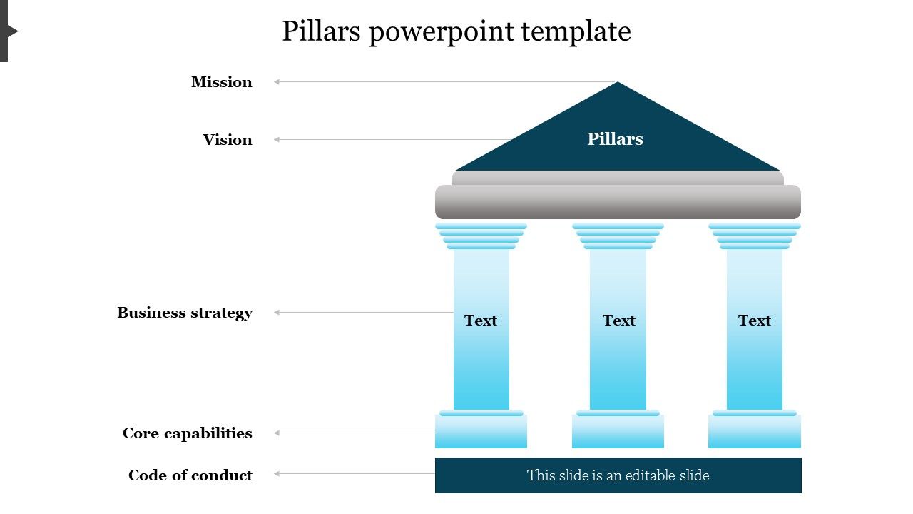
In the realm of visual communication, the design plays an indispensable role. The principles of design intertwine creativity and function, creating presentations that not only inform but also captivate. When we delve into this fascinating world, it becomes evident that certain visual elements serve as the very foundation of effective communication. This article explores the five essential pillars of design that can bolster your business presentations, showcasing the best PowerPoint templates to help harness these principles for powerful outcomes.
1. Balance: Equilibrium in Visual Weight
Balance, a cornerstone of design, refers to the distribution of visual weight within a composition. It can be symmetrical, where elements mirror each other on either side, or asymmetrical, where differing elements provoke interest yet maintain an overall equilibrium. Achieving balance in presentations ensures that viewers are not overwhelmed or distracted by a lopsided layout. The right pillars PowerPoint templates ingeniously employ balance to guide the audience’s gaze, establishing a visual hierarchy that leads to enhanced comprehension. Look for templates with thoughtful alignment and diversified spacing that enhance clarity without compromising aesthetic appeal.
2. Contrast: The Drama of Differences
Contrast is the juxtaposition of dissimilar elements, be it color, size, or texture. This principle infuses drama into a presentation, capturing attention while facilitating differentiation between information. In business contexts, where data-laden slides often dominate, the strategic use of contrast transforms monotonous figures into engaging visuals. Fascinating PowerPoint templates incorporate striking contrasts, incorporating vibrant hues against muted backgrounds or varying font sizes to accentuate key messages. This not only enhances readability but also fosters an inviting atmosphere conducive to discourse. Use templates that masterfully balance light and dark elements to create a stunning visual narrative.
3. Emphasis: Spotlighting the Important
Emphasis serves to highlight significant components of a presentation, guiding the audience’s focus to crucial information. Effective design recognizes that not all data carries the same weight; thus, establishing hierarchy is paramount. This can be achieved through scale, color, or even the strategic placement of elements. The finest PowerPoint templates inherently understand this principle, utilizing bold typography and vivid imagery to draw attention where it is most needed. Business presentations often hinge upon a few pivotal points, and templates that accentuate these through thoughtful design choices can elevate the overall narrative structure. As such, consider templates that harness emphasis to champion the core messages of your presentation.
4. Repetition: The Rhythm of Design
Repetition is a principle that cultivates consistency and unity within a presentation. By integrating repetitive elements—such as colors, fonts, or shapes—designers establish a coherent visual experience. This principle is particularly powerful in business settings, where uniformity can convey professionalism and reliability. PowerPoint templates that embrace repetition not only enhance brand recognition but also ensure that the audience can easily follow the flow of information. Templates with cohesive styles across multiple slides create a polished effect that reinforces your message while establishing a recognizable identity. Look for designs that weave repetitive elements throughout to create a seamless narrative thread.
5. White Space: The Power of Nothingness
Perhaps the most understated principle in design is the strategic use of white space. Often misconceived as wasted space, white space serves as a powerful tool that breathes life into a presentation. It allows for clarity, guiding viewers’ focus to the most critical information while preventing cognitive overload. Well-designed PowerPoint templates harness the power of white space, creating an inviting layout that exudes sophistication. By carefully considering the spacing around text and images, templates that embrace white space enhance overall comprehension and retention. As business presentations often seek to convey complex information succinctly, opting for templates that employ white space effectively allows for a remarkable simplification of ideas.
In conclusion, the principles of design—balance, contrast, emphasis, repetition, and white space—form the bedrock of visually captivating presentations. Each principle interplays with the others, creating a harmonious environment conducive to effective communication. The best Pillars PowerPoint templates leverage these principles to their advantage, crafting powerful business presentations that resonate with audiences. By utilizing thoughtfully designed templates, professionals can ensure their messages are not only heard but also felt. Embrace the potential of these design pillars to elevate your presentations, unlocking the potential to engage, inform, and inspire. Dive into the world of stunning designs today, and elevate your business presentations to a realm where they can truly shine.


Leave a Comment