

Ever stared at your footage, wondering why it doesn’t scream “Hollywood magic” the way your favorite films do? You’ve tried every LUT under the sun, tweaked saturation until your eyes bleed, and yet—something’s still missing. What if I told you the secret isn’t in a pre-baked filter, but in the alchemy of color grading itself? Forget the shortcuts. Let’s dive into the gritty, glorious world of Hollywood-style color grading—no LUTs required.
Picture this: You’re on set, the sun’s blazing, the talent’s nailing their marks, and the director’s yelling “We need more *mood*!” Enter the Digital Imaging Technician (DIT), the unsung hero who transforms raw footage into cinematic gold. They don’t just slap on a filter. They sculpt light, balance shadows, and coax emotion from pixels like a painter with a palette knife. And guess what? You can too.
So, how do you color grade like a pro without relying on LUTs? Buckle up. We’re about to embark on a journey through the fundamentals, the nuances, and the downright rebellious techniques that’ll make your footage feel like it belongs on the big screen.
The Foundation: Understanding Color Theory Like a Cinematographer
Before you touch a single slider, you need to speak the language of color. Hollywood doesn’t just throw hues together willy-nilly. Every choice is deliberate, rooted in psychology, physics, and storytelling. Let’s break it down.
First, familiarize yourself with the color wheel. Not just the basic RGB model, but the nuanced relationships between complementary, analogous, and triadic colors. Complementary colors (opposites on the wheel) create tension and vibrancy—think fiery oranges against cool blues. Analogous colors (neighbors on the wheel) evoke harmony and cohesion, perfect for serene or nostalgic scenes. Triadic colors (three evenly spaced hues) bring energy and balance, ideal for dynamic compositions.
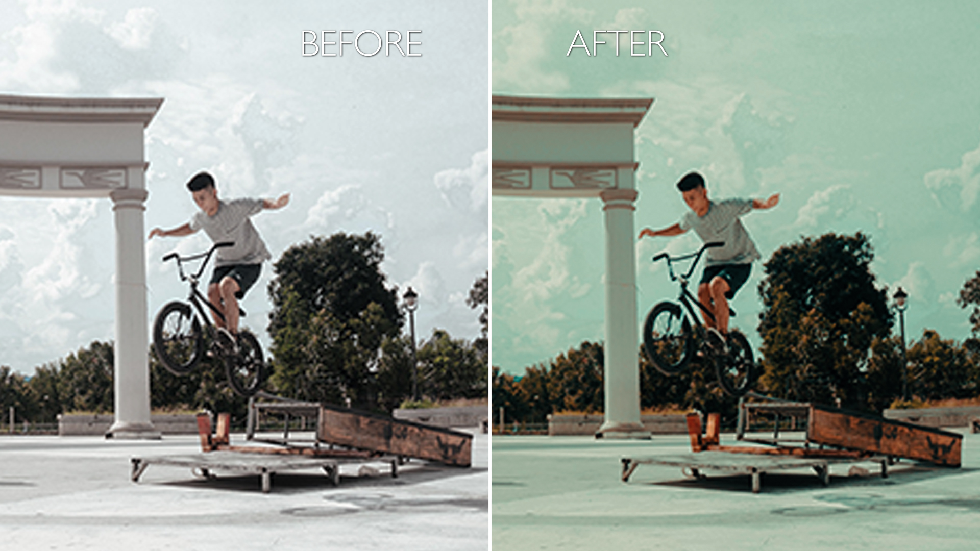
But here’s where it gets interesting: color temperature. Warm tones (reds, oranges) feel inviting, intimate, or even dangerous. Cool tones (blues, teals) suggest calm, distance, or melancholy. Hollywood leans heavily on this. A thriller might drench its scenes in sickly greens. A romance bathes everything in golden hour glow. Your footage should do the same.

Start by analyzing reference footage. Pick a scene from a film that nails the mood you’re after. Study its color palette. How does the director use shadows? Where do highlights bloom? Reverse-engineer their choices. This isn’t cheating—it’s learning the rules so you can break them later.
The DIT’s Toolkit: Mastering the Core Adjustments
Now that you’re fluent in color theory, let’s talk tools. A Hollywood DIT doesn’t rely on presets. They wield a suite of adjustments with surgical precision. Here’s what you need to dominate:
Exposure & Contrast: The bedrock of your grade. Overexposed footage feels flat; underexposed footage feels murky. Use the waveform monitor to nail your exposure first. Then, adjust contrast to sculpt depth. Hollywood loves high contrast for drama, low contrast for subtlety. But don’t just crank the contrast slider—use it to guide the viewer’s eye. Darker areas recede; brighter areas pop.
Shadows & Highlights: These are your secret weapons. Shadows can be crushed to black for moody intensity or lifted to reveal texture. Highlights can be tamed to avoid blown-out skies or pushed to create a dreamy, overexposed look. The key? Balance. If you crush shadows too hard, you lose detail. If you blow out highlights, you lose information. Aim for a gentle roll-off in both.
Hue, Saturation, and Luminance (HSL): This is where the real magic happens. HSL sliders let you target specific colors and tweak them individually. Want to mute skin tones slightly to avoid distraction? Desaturate them. Need to make a character’s red jacket pop against a green background? Shift its hue. Feeling adventurous? Push luminance to make certain colors glow or recede. The possibilities are endless—if you’re willing to experiment.
Curves: Forget the basic contrast slider. Curves are your scalpel. They let you reshape the tonal range of your image with precision. Draw an S-curve to increase contrast, or flatten it for a flatter, more natural look. Use the RGB curves to shift color balance. Want more red in the shadows? Pull the red curve down in the darkest areas. It’s like painting with light.
The Art of the Grade: Crafting Mood and Emotion
Now that you’ve got the technical chops, let’s talk artistry. Color grading isn’t just about fixing problems—it’s about enhancing storytelling. Every adjustment should serve the narrative. Here’s how to do it like a pro:
Mood Mapping: Start by defining the emotional tone of your scene. Is it tense? Use cool, desaturated tones with high contrast. Is it romantic? Bathe it in warm, soft light. Is it surreal? Push colors into unnatural territory. Think of your grade as a visual soundtrack—it should complement the story, not compete with it.
Skin Tones: They’re the anchor of your grade. Audiences notice them first. If skin tones look off, the whole scene feels wrong. Use vectorscopes to ensure they’re consistent. Warm them up slightly for a cozy feel, or cool them down for a clinical look. But never let them clash with the surrounding colors. A face in a sea of green? That’s a recipe for distraction.
Environmental Storytelling: The world around your characters should reflect their journey. A dystopian future might drown in sickly yellows and teals. A fantasy realm could shimmer with iridescent hues. Even mundane locations can be transformed with color. A diner at night might glow with neon reds, while a quiet forest bathes in emerald mist. Let the environment do the talking.
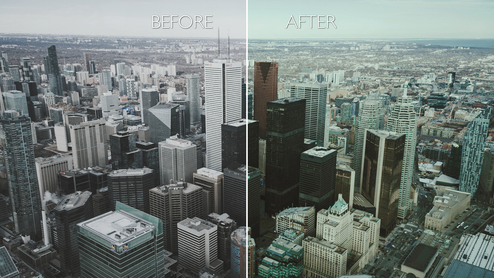
Temporal Consistency: If you’re grading a sequence, ensure the colors flow naturally from shot to shot. A sudden shift in temperature can jolt the viewer out of the story. Use a reference frame to maintain consistency. If Scene A is warm and golden, Scene B shouldn’t suddenly feel icy unless there’s a narrative reason for it.
Advanced Techniques: Breaking the Rules (Responsibly)
Now that you’ve mastered the basics, it’s time to get creative. Hollywood DITs don’t just follow rules—they rewrite them. Here’s how to push your grade into uncharted territory:
Color Grading in Layers: Instead of applying adjustments globally, break your grade into layers. Start with a base grade for overall balance. Then, add a layer for skin tones, another for highlights, and another for shadows. This gives you granular control and prevents one adjustment from clobbering another.
Secondary Corrections: Target specific areas of your image with masks or rotoscoping. Want to make a character’s eyes pop? Select them and boost saturation. Need to isolate a neon sign in the background? Desaturate everything else. Secondary corrections let you fine-tune details that global adjustments miss.
Split Toning: This is where things get fun. Split toning lets you assign different hues to shadows and highlights. Want shadows to be cool blue and highlights to be warm orange? Go for it. Split toning can add depth and richness to your grade, but use it sparingly—overdoing it can make your footage look like a bad Instagram filter.
Grain & Texture: Digital footage can look sterile. Hollywood DITs often add subtle film grain or texture to mimic the organic feel of celluloid. Use a grain overlay sparingly—too much and you’ll lose detail. The goal is to enhance, not overwhelm.
The Final Polish: Exporting Like a Pro
You’ve nailed your grade. Now, don’t ruin it with a sloppy export. Here’s how to ensure your footage looks its best:
Color Space: Stick to a standard like Rec. 709 for broadcast or sRGB for web. If you’re delivering to a cinema, use DCI-P3. Exporting in the wrong color space can make your grade look washed out or oversaturated.
Bit Depth: Always export in 10-bit or higher if possible. 8-bit footage can posterize when graded heavily. 10-bit preserves smoother gradients and more detail.
File Format: Use a lossless format like ProRes or DNxHD for maximum quality. Avoid heavily compressed formats like H.264 unless you’re delivering to a platform with strict size limits.
Metadata: Include color space and gamma information in your export. This ensures the next person in the pipeline knows how to handle your footage.
And there you have it—your footage now carries the weight of a Hollywood masterpiece. No LUTs. No shortcuts. Just pure, unfiltered color grading alchemy.
The next time you’re staring at your timeline, wondering why your footage doesn’t feel “cinematic,” remember: the magic isn’t in the tools. It’s in the vision. So grab your scopes, fire up your software, and start sculpting. The big screen is waiting.


Leave a Comment