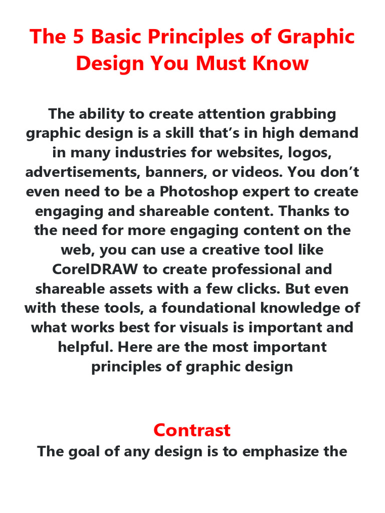
Graphic design is an amalgamation of creativity, art, and communication. It employs visual elements to convey ideas and messages effectively, yet it thrives on foundational principles that guide a designer’s journey. Are you ready to dive into the colorful world of graphic design? What if mastering just a few principles could elevate your work from mundane to mesmerizing? The challenge lies in grasping these fundamentals and applying them deftly in your projects. Here, we will explore the golden rules of graphic design every beginner must learn—creating a strong foundation upon which to build exceptional design skills.
The first principle to embrace is **Contrast**. This isn’t merely about juxtaposing colors; it’s about creating interest and drawing attention. Contrast can manifest through variations in color, size, shape, and texture. Imagine a serene pastel background with bold, dark typography. The visual disparity ignites curiosity, compelling the viewer to engage with the content. Beginners often overlook this crucial aspect, leading to flat designs that fail to captivate. A strategic application of contrast can guide the audience’s gaze, navigating them through your message with ease.
Next, we navigate to **Alignment**. This principle serves as a silent yet powerful architect of your design. Alignment helps establish a visual connection between elements, creating a coherent and organized composition. Whether left-aligned, right-aligned, or centered, the choice should resonate with the theme and intent of the design. When elements are thoughtfully aligned, they foster a sense of harmony and professionalism. Explore different alignments—your design will thank you for it. Consider experimenting with asymmetrical alignments for a touch of intrigue and surprise.
Equally significant is the principle of **Repetition**. This may seem elementary, yet it wields tremendous power to create consistency and establishment within your work. Repetition lies in using similar colors, fonts, shapes, or textures across a design project. Imagine a branding campaign where a specific color palette echoes through every visual medium. This continuity not only reinforces brand identity but also steers the audience’s perceptual experience. In an age where visual stimuli bombard us daily, repetition can anchor your design in the viewer’s memory, making it both recognizable and impactful.
Delving deeper, we encounter **Proximity**. This principle dictates the spatial relationships between elements. By clustering related items together, proximity enhances the clarity of information conveyed. Think of it as the art of organization—design elements positioned closely signify a connection, while those spaced apart suggest independence. Beginners often create chaotic layouts without understanding the importance of proximity, leading to confusion rather than clarity. Mastering proximity will transform any disarray into a symphony of order.
Another intriguing challenge arises with the principle of **Balance**. Balance in design can be symmetrical or asymmetrical, each offering its unique charm. Symmetrical balance produces a sense of formality and stability, whereas asymmetrical balance introduces dynamism and energy. Achieving balance requires a keen eye and often a willingness to experiment. Consider the composition of a magazine cover; the elements must be balanced to evoke the right emotional response from the audience. A well-balanced design feels complete and appeals to the viewer’s innate desire for order.
Now let’s discuss **Hierarchy**. This principle emphasizes the importance of guiding a viewer’s focus through varying levels of importance in design elements. Through size, color, and positioning, a designer creates a hierarchy that essentially communicates what the audience should notice first, second, and so forth. For instance, in a website layout, larger headings usually capture attention before body text. Understanding and implementing hierarchy can make or break the message conveyed; it’s about leading your audience by the hand through a visual narrative.
Embracing **Space**, or white space, is often overlooked yet imperative. White space is not merely a void; it’s a designing tool that provides breathing room to your content. It enhances readability and focus, allowing the essential elements to shine without overwhelming the viewer. Think of it as the silence in music that accentuates the notes; just as silence is essential for melody, white space is vital for clarity in design. Utilize it effectively to transform cluttered designs into masterpieces that resonate.
Last but not least, the principle of **Color Theory** cannot be disregarded. Colors evoke emotions and set the tone of your design. Understanding the psychological impact of various colors can help convey the desired message more effectively. For instance, blue may evoke feelings of trust and calmness, while red often signifies energy or urgency. A cohesive color palette can unify a design, while a poorly chosen scheme can detract from its effectiveness. Don’t shy away from experimenting with color harmony—it can create a vivid language of its own within your designs.
In conclusion, these principles of graphic design form the bedrock for every aspiring designer. Contrast, alignment, repetition, proximity, balance, hierarchy, space, and color theory each play a vital role in the creation of visually captivating and communicatively effective designs. As you embark on your creative journey, challenge yourself to integrate these fundamentals into your projects. Will you commit to mastering these golden rules, or will you allow your work to linger in the shadow of mediocrity? The choice lies in your hands, ready to mold your design endeavors into a flourishing artistic expression.