The world of design is akin to a grand symphony, where each note plays an integral role in creating a harmonious whole. In this symphony, contrast serves as an arresting crescendo—an element that commands attention and fosters visual engagement. Understanding contrast in the principles of design unveils a rich conceptual tapestry that can elevate any creative endeavor. Below, we delve into the essence of contrast, exploring its definition, manifestations, and practical applications through vivid examples and insightful tips.
Defining Contrast: More Than Just Light and Dark
Contrast can be defined as the juxtaposition of differing elements within a composition, which not only highlights their differences but also creates a compelling dialogue between them. It influences how viewers perceive and interpret visual information. Picture an artist wielding a brush, alternating between vibrant hues and muted tones; this delicate interplay evokes emotion and narrative, guiding the observer through the artwork’s story. In essence, contrast is the art of playing with differences, whether in color, shape, size, or texture.
The Varied Forms of Contrast: A Palette of Possibilities
Contrast manifests in several forms, each evoking a unique response:
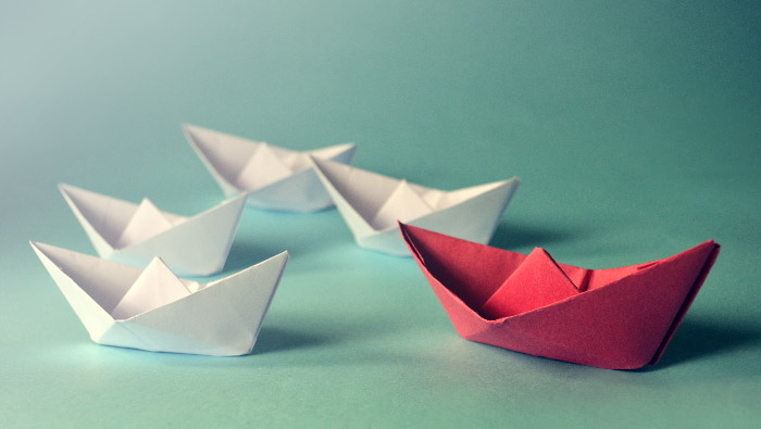
- Color Contrast: This type of contrast hinges upon the colors employed within a design. Pairing complementary colors—like fiery reds against cool greens—can create visual dynamism that captures the eye. Consider the impact of a bold red font against a pristine white background; it not only signifies significance but also generates a visual pop that demands attention.
- Value Contrast: Value refers to the lightness or darkness of a color. High value contrast, such as stark blacks juxtaposed against brilliant whites, can stimulate vigor, while low value contrast might evoke calm and subtlety. Think of a dramatic black-and-white photograph—its interplay of shadows and highlights draws out intricate details, transforming the mundane into the extraordinary.
- Shape Contrast: Differentiating between geometric and organic forms can breathe life into a design. Geometric shapes, with their sharp edges and symmetry, can clash beautifully against the fluidity of organic forms like curves and splines. Visualizing a sharp triangle against a soft, flowing circle creates a tension that draws the viewer’s eye and ignites intrigue.
- Size Contrast: Size plays a critical role in establishing hierarchy within a design. A miniature element positioned alongside a significantly larger one creates a sense of perspective, beckoning viewers to explore the relationship between them. Picture a colossal sculpture dwarfing a tiny figure; this contrast melds scale with emotional weight, provoking thought and reflection.
- Texture Contrast: Mixing textures, such as smooth with rough or sleek with gritty, can enhance tactile appeal and visual interest. Imagine a glossy, polished surface juxtaposed with a weathered, rustic surface—this dialogue stimulates the senses, allowing viewers to almost feel the textures through their sight.
Applying Contrast: Practical Tips for Designers
With a solid grasp of contrast, designers can apply this principle strategically to enrich their work. Here are a few actionable tips:
- Establish a Focal Point: Use contrast to direct attention toward a crucial element. By surrounding a focal point with contrasting colors or shapes, you create a visual magnet that naturally attracts the viewer’s gaze. This is particularly vital in graphic design, where you want the message to resonate clear and bold against cluttered backgrounds.
- Create Visual Hierarchy: In any composition, establish a clear hierarchy. Larger, bolder elements tend to draw immediate attention, while smaller, subdued elements recede in importance. Utilize size and value contrast to clearly differentiate between primary and secondary information; this enables effective communication and enhances readability.
- Experiment with Color Theory: Understand the intricacies of the color wheel. Complementary colors—those lying directly opposite each other—can create stunning contrast, while analogous colors—those adjacent on the wheel—tend to harmonize. Experimentation with color combinations can yield surprising, delightful results.
- Be Mindful of Context: Consider the context of its application. In a minimalist design, high contrast might enhance starkness; conversely, in a bohemian style, softer contrasts may cultivate warmth and intimacy. Adapt contrast to align with the emotional tone and purpose of the design.
- Embrace Negative Space: Contrast isn’t just about busy elements competing for attention; it’s also about what’s left out. Negative space—areas devoid of content—can create striking contrast against filled areas, allowing the viewer’s eye to rest and creating balance. This interplay can enhance comprehension, making complex ideas more digestible.
Conclusion: The Power of Contrast in Design
Contrast, as a principle of design, is a nuanced tool that transcends mere aesthetics; it’s a powerful means of communication that elicits emotion and inspires connection. Whether through the juxtaposition of colors, shapes, or textures, contrast shapes our perceptions, guiding the viewer’s journey through visual narratives. By mastering the art of contrast, designers can craft compelling compositions that resonate deeply, inviting audiences into a world where every element plays a vital role in the symphony of artistry.