

The realm of design is as boundless as the imagination itself, yet at its core lie fundamental principles that guide creators toward visual harmony. Among these principles, color plays a pivotal role. Understanding the various types of color palettes available can greatly enhance the effectiveness of visual communication. Here, we delve into seven distinct types of color palettes, exploring their characteristics, applications, and the emotional resonance they evoke in design.
1. Monochromatic Color Palettes
Monochromatic palettes consist of variations in lightness and saturation of a single hue. This type of palette is renowned for its simplicity and elegance, making it a favored choice in minimalistic design and interior spaces. Designers may leverage a range of tints, tones, and shades, creating visual interest while maintaining cohesiveness. For instance, a palette primarily centered around a soft blue can result in a serene and tranquil ambiance, ideal for spa websites or wellness brands. However, the challenge lies in finding the right balance; too much of one color can lead to monotony. Hence, incorporating textures and patterns can add depth and intrigue.
2. Analogous Color Palettes
Analogous palettes are crafted by selecting three adjacent colors on the color wheel. Such combinations often evoke a sense of harmony and unity, stemming from their inherent similarity. An analogous palette may range from vibrant yellows, to zesty oranges, and soft reds, creating warmth and energy. This palette is particularly effective in designs that aim to convey a specific feeling—think of autumnal themes or citrus-inspired designs. By carefully considering the dominant color and its complements, designers can achieve an inviting and cohesive look that visually pleases the viewer’s eye.
3. Complementary Color Palettes
Complementary palettes are born from the juxtaposition of colors directly opposite each other on the color wheel. This striking contrast produces dynamic and vibrant visuals capable of capturing attention effectively. Utilizing complementary colors can produce impactful designs, often employed in advertising to evoke a sense of urgency or excitement. For example, the pairing of a rich purple with a vivid yellow can create an eye-catching poster that engages the viewer’s gaze. However, moderation is key; overuse can lead to jarring compositions that may overwhelm rather than intrigue.
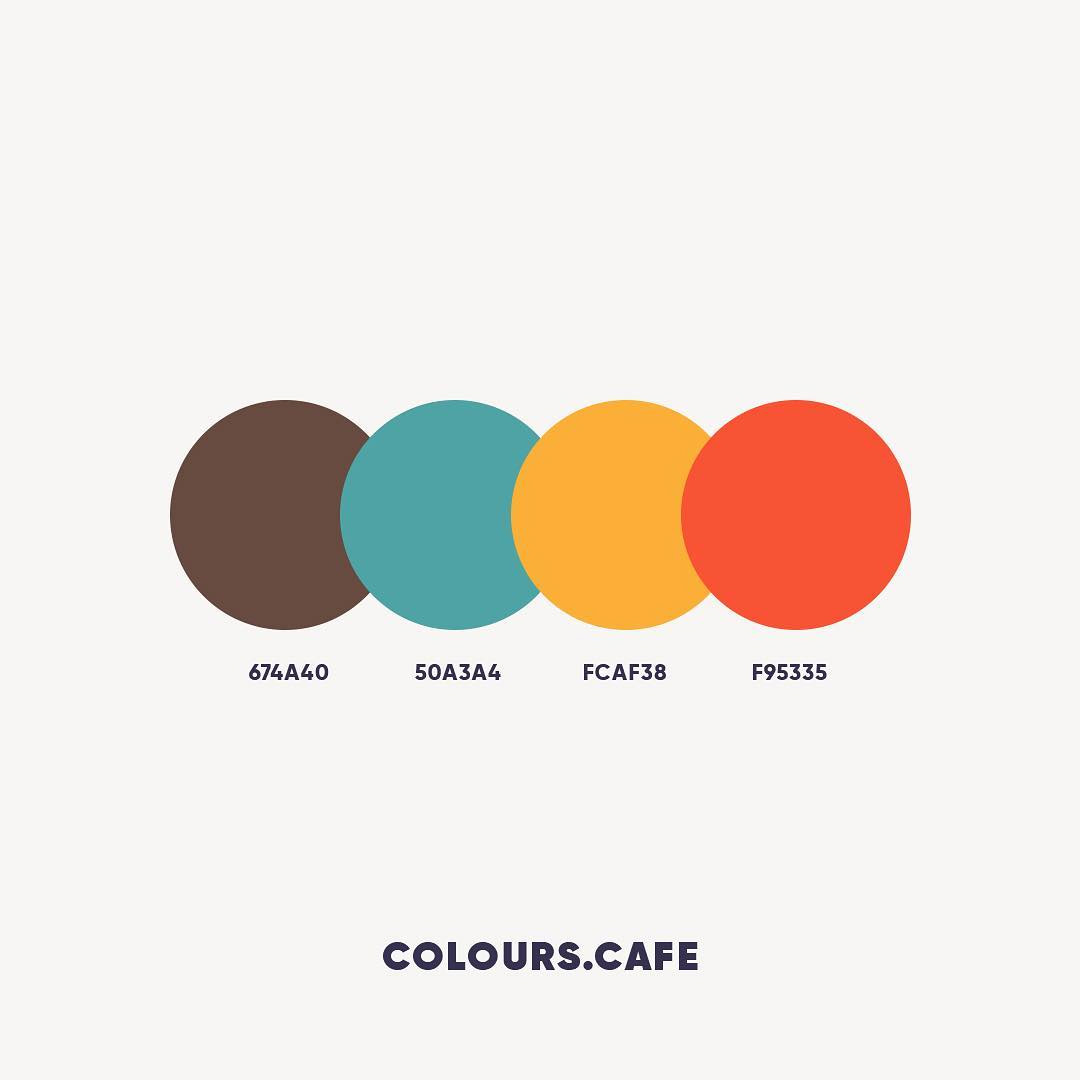
4. Split-Complementary Color Palettes
For those seeking the best of both worlds, split-complementary palettes present a more nuanced approach. This palette comprises one base color and the two adjacent colors to its complementary. The resulting combination offers high contrast, yet retains a degree of cohesion that prevents the design from becoming chaotic. For example, a teal base can be invigorating when accompanied by soft reds and oranges, creating a vibrant yet sophisticated aesthetic. This type of palette is especially effective in branding, where a striking yet harmonious identity is crucial in retaining consumer attention.
5. Triadic Color Palettes
Triadic palettes emerge from the selection of three colors evenly spaced around the color wheel, creating a vibrant and balanced aesthetic. The interplay between these colors can result in designs that are both energetic and harmonious. Consider a palette that features primary colors: red, blue, and yellow. This can be vividly expressive, perfect for children’s products or playful brands. The challenge with triadic color schemes lies in selecting the right proportions; designers must balance the intensity of each color to avoid visual disarray while still achieving a stunning, dynamic arrangement.
6. Tetradic Color Palettes
The tetradic palette transcends the triadic arrangement by incorporating four colors into the design framework, forming two complementary color pairs. This complexity affords designers a rich palette with multiple contrasting elements that can lead to visually striking materials. When used judiciously, a tetradic palette can produce innovative compositions that invoke curiosity. For example, pairing deep greens with lively pinks and earthy browns creates an organic yet eclectic feel, ideal for brands aiming to capture a vibrant personality without compromising sophistication. Ensuring a predominant color helps anchor the design, ensuring it doesn’t spiral into confusion.
7. Custom Color Palettes
Finally, custom color palettes allow designers to tread off the beaten path by creating unique combinations tailored to a specific project or brand identity. This versatility embodies the spirit of creativity, enabling designers to meld colors to elicit particular emotions or reactions. For example, a custom palette composed of dusky mauves, deep blues, and metallics can evoke a sense of luxury and sophistication, ideal for high-end fashion brands. The primary advantage of developing a custom palette lies in its ability to differentiate a brand’s visual identity in a saturated market, ensuring it remains memorable and distinctive.
In conclusion, mastering the principles of design and the various types of color palettes is essential for any designer. Each palette serves as a tool to convey specific messages, emotions, and identities. By understanding when and how to use each type, designers can elevate their work, creating visuals that resonate profoundly with their intended audience. Whether seeking simplicity with monochromatic selections or vibrancy through complementary schemes, the savvy designer chooses their colors with purpose, forging connections and evoking responses through the kaleidoscopic language of color.


Leave a Comment