

In the rigid world of design, grids are the scaffolding that holds everything together—orderly, predictable, and safe. They guide the eye, maintain harmony, and ensure content is digestible. Yet, there’s a secret thrill in defiance. Breaking the grid isn’t about chaos; it’s about controlled rebellion. It’s the difference between a poster that whispers and one that shouts. When done right, it transforms a layout from functional to unforgettable. But cross the line, and your design collapses into visual cacophony. So, how do you break the grid without toppling your carefully constructed world? The answer lies in understanding the rules before you bend them.
The Grid’s Silent Power: Why It Exists in the First Place
Grids aren’t just aesthetic choices—they’re psychological anchors. They create rhythm, establish hierarchy, and reduce cognitive load. A well-structured grid acts like a silent conductor, guiding the viewer’s gaze with effortless precision. It’s the reason a magazine spread feels intuitive, even when you’re skimming. But grids also have a shadow side: they can make designs feel sterile, predictable, or worse—boring. The key is recognizing that grids are tools, not prisons. They provide the structure, but the magic happens when you dare to disrupt it.
Consider the humble newspaper. Its grid is unyielding—columns lock content in place, headlines align, and images nestle obediently within their frames. Yet, even here, designers inject life. A bold image might bleed into the margin. A headline might stretch across multiple columns, defying the grid’s rigid boundaries. These subtle rebellions don’t destroy the layout; they elevate it. They signal to the reader: This matters. Pay attention. The grid remains, but its authority is momentarily suspended.
The Art of Controlled Chaos: When to Break the Rules
Breaking the grid isn’t about randomness—it’s about intention. The most striking designs often teeter on the edge of order and anarchy, where every disruption serves a purpose. But how do you know when to break free? Start with the content itself. If your message demands urgency, rebellion might be the perfect vehicle. A sale announcement, a protest poster, or a rebellious brand campaign all thrive on visual disruption. The grid’s rigidity would muffle their urgency; breaking it amplifies it.
Another cue is rhythm. If your design feels monotonous, a single, deliberate break can restore balance. Imagine a website where every section adheres to a strict grid—until a hero image bursts through, full-width and unapologetic. That moment of defiance doesn’t just capture attention; it resets the viewer’s expectations. It says, This is different. This is important.
Timing is everything. A grid break should feel like a plot twist—not a glitch. Place it where the eye naturally pauses, such as after a section of dense text or before a call-to-action. This ensures the disruption feels intentional, not accidental. Think of it like punctuation in writing. A comma pauses; an exclamation mark demands attention. Your grid breaks should do the same.
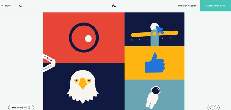
Strategic Disruptions: Techniques That Work
Not all grid breaks are created equal. Some are subtle, like a misaligned element that pulls the eye just enough to feel alive. Others are bold, like a full-bleed image that shreds the grid’s constraints. The technique you choose depends on your goal. Here are a few battle-tested strategies:
1. The Bleed
A classic move in print design, the bleed occurs when an image or color extends beyond the grid’s boundaries, creating a sense of expansion. It’s as if the design is bursting at the seams. This technique works particularly well for high-impact visuals—think hero images, backgrounds, or dramatic typography. The key is to ensure the bleed feels intentional, not like a mistake. A well-executed bleed makes the grid feel like a cage that’s been torn open.
2. The Asymmetrical Hero
Most grids rely on symmetry to create balance. But what if you flipped the script? An asymmetrical hero section—where an image or headline juts out unpredictably—can create dynamism. This technique is especially effective for landing pages or portfolios, where you want to make a strong first impression. The trick is to ensure the asymmetry still feels grounded. Use alignment cues, like a strong baseline or a repeating color, to tether the disruption to the rest of the design.
3. The Overlap
Overlapping elements are a subtle yet powerful way to break the grid. A headline might overlap an image. A button might hover slightly above its expected position. These small rebellions create depth and tension, making the design feel more tactile and engaging. The overlap should feel deliberate, not sloppy. Use shadows, transparency, or contrasting colors to clarify the hierarchy and guide the viewer’s eye.
4. The Typographic Rebellion
Typography is the voice of your design. When it adheres strictly to the grid, it can feel muted. But when a single line of text stretches beyond its column, or a word is rotated at an angle, it becomes a statement. This technique is particularly effective for headlines or pull quotes. The key is to ensure the typographic break doesn’t compromise readability. Use contrast—bold weights, vibrant colors, or unexpected scales—to make the disruption feel intentional.
The Fine Line: Avoiding Visual Anarchy
Breaking the grid is exhilarating, but it’s easy to veer into chaos. The difference between a masterful disruption and a messy one often comes down to restraint. Here’s how to keep your rebellion in check:
Anchor the Chaos: Every disruption should have a tether. If an image bleeds into the margin, ensure there’s a visual cue—like a strong color or a repeating shape—that ties it back to the grid. This prevents the design from feeling like it’s unraveling.
Prioritize Hierarchy: Not all elements deserve to break the grid. Reserve your rebellions for the most important parts of your design. A single, well-placed disruption is more effective than multiple, competing ones.
Test the Flow: After breaking the grid, walk through your design as if you’re seeing it for the first time. Does the disruption enhance the message, or does it distract? If it feels jarring without purpose, dial it back.
Embrace the Grid’s Ghost: Even when you break the grid, its presence should linger. Subtle alignments—like a baseline grid or consistent spacing—can keep the design cohesive. The grid doesn’t have to disappear entirely; it just needs to take a backseat.
Real-World Inspiration: Designs That Nailed the Grid Break
Some of the most iconic designs in history owe their impact to a well-timed grid break. Take Saul Bass’s posters for films like Vertigo or The Man with the Golden Arm. His use of diagonal lines and asymmetrical compositions didn’t just break the grid—they redefined it. The disruptions felt intentional, dramatic, and utterly necessary.
In digital design, brands like Apple and Nike often use grid breaks to create moments of surprise. A product image might float outside its container. A headline might stretch across the screen, defying the expected column width. These choices aren’t arbitrary; they’re calculated to make the user pause, to feel the weight of the message.
Even in typography, grid breaks can transform a mundane layout into something memorable. David Carson’s work for Ray Gun magazine in the 1990s is a masterclass in rebellion. He rotated text, overlapped elements, and ignored traditional alignment—all in service of the content’s tone. The result? Designs that felt urgent, raw, and alive.
The Psychology Behind the Break: Why It Works
There’s a neurological reason why grid breaks captivate us. Our brains are wired to seek patterns, but they also crave novelty. When a design adheres strictly to a grid, it’s easy to dismiss it as background noise. But when a disruption occurs—even a subtle one—it triggers a dopamine response. What’s happening here? Why does this feel different? The viewer is suddenly engaged, their curiosity piqued.
This psychological pull explains why grid breaks are so effective in advertising. A static billboard is forgettable. A billboard with a single, unexpected element—a hand reaching out, a word tilted at an angle—stops traffic. It’s not just about standing out; it’s about creating a moment of connection.
Of course, this doesn’t mean every design needs a grid break. Sometimes, the most powerful choice is to embrace the grid’s discipline. But when you do decide to rebel, do it with purpose. Make the viewer feel the thrill of the unexpected.
Your Turn: Experiment and Iterate
Breaking the grid isn’t a one-size-fits-all solution. It’s a playground for experimentation. Start small: adjust the alignment of a single element. Try bleeding an image into the margin. Rotate a headline just enough to feel alive. Document your experiments. What worked? What felt off? Over time, you’ll develop an intuition for when to break the rules and when to honor them.
Remember, the grid is your foundation. It’s the stage on which your design performs. But the performance? That’s where the magic happens. So go ahead—tear down a wall. Let your design breathe. Just make sure it still has a home to return to.
The best designs aren’t those that follow the rules. They’re the ones that know when to break them—and when to make the break unforgettable.


Leave a Comment