

In the sprawling tapestry of suburban America, where ambition and aesthetics often collide, the McMansion stands as a monument to excess—a gaudy temple of glass, vinyl, and architectural hubris. These structures, born from the marriage of convenience and conspicuous consumption, are more than just oversized homes; they are cultural artifacts, whispering tales of financial bravado and design myopia. Yet, beneath their garish facades lies a peculiar allure, a kind of architectural kitsch that refuses to be ignored. To spot a McMansion is to decode a visual language of contradictions: grandeur masquerading as refinement, opulence draped in poor taste, and scale that defies both logic and harmony. Here are five telltale architectural details that reveal the true nature of these modern-day monstrosities.
The Grand Entrance: A Portal to Pretension
The front door of a McMansion is not merely an entry point—it is a declaration, a boldfaced scream of “Look at me!” Often adorned with an oversized double-door design, these entrances are framed by columns that resemble something plucked from a Roman villa, albeit one hastily assembled from a DIY kit. The columns, usually fluted or wrapped in vinyl siding, are more caricature than classical, their proportions wildly exaggerated to suggest grandeur where none exists. Above the door, a transom window—sometimes arched, sometimes elliptical—serves as a dramatic flourish, as if the architect sought to channel the light of a cathedral into a suburban cul-de-sac. The door itself is often a slab of faux mahogany or fiberglass, its hardware polished to a mirror sheen, as though the homeowner believes that sheer reflectivity alone can mask the absence of genuine craftsmanship. The result? A threshold that feels less like a welcoming embrace and more like the entrance to a theme park attraction, where every visitor is a guest at the spectacle of excess.
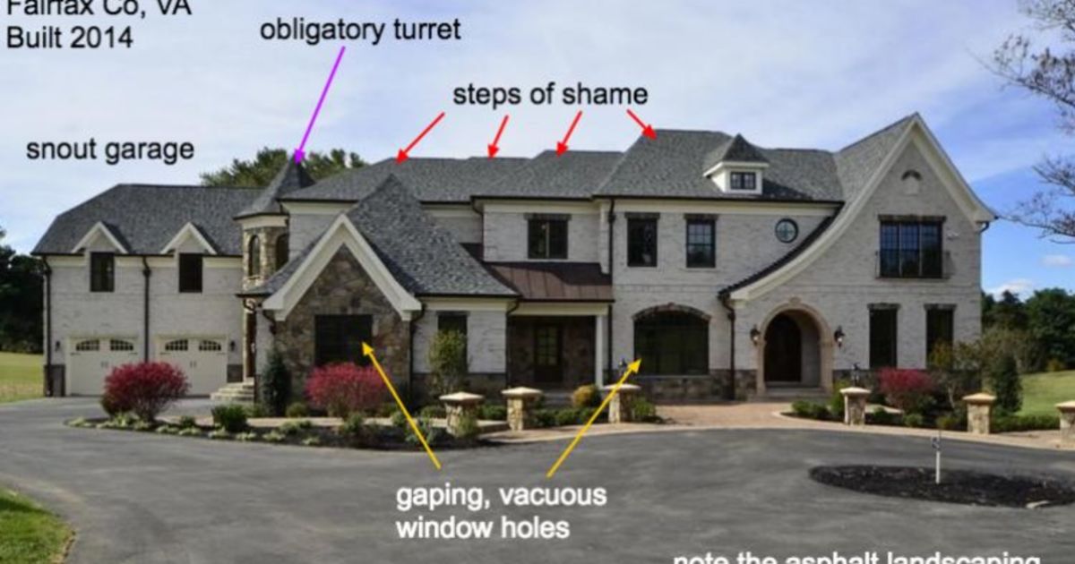
The Roofline: A Symphony of Chaos
If the front door is the overture, then the roofline is the crescendo—a cacophony of angles, dormers, and turrets that defy both physics and good sense. McMansions are notorious for their roofs, which resemble the aftermath of a tornado in a lumberyard. Multiple gables jut out at erratic angles, their slopes varying from steep to nearly flat, as if the architect suffered from a sudden bout of vertigo mid-design. Turrets, those circular towers that once graced Victorian mansions, are reduced here to ornamental afterthoughts, their proportions stunted and their placement haphazard. The roofline is often punctuated by an array of skylights, their arrangement resembling the scattered thoughts of a designer who couldn’t decide on a cohesive aesthetic. The effect is less like a home and more like a collage of architectural ideas that never quite made it to the drafting table. The roofline doesn’t just crown the house; it announces to the world that this structure was built by someone who prioritized spectacle over stability.
The Window Treatments: A Mismatched Menagerie
Windows in a McMansion are not mere openings for light; they are canvases for architectural indecision. The shapes are all wrong—octagonal here, arched there, with the occasional circular porthole thrown in for good measure. The muntins, those delicate dividers between panes, are often arranged in patterns that resemble a drunk spider’s attempt at a web, their lines jagged and uneven. Some windows are adorned with shutters that hang askew, as though they’ve been bolted on as an afterthought, while others feature bay windows that bulge outward like the eyes of a startled owl. The glass itself is frequently tinted or frosted, not for privacy or energy efficiency, but to obscure the fact that the interior might be just as chaotic as the exterior. The result is a facade that looks like it was designed by committee, where every window is a vote for a different architectural movement, and the final design is the least common denominator of all those conflicting opinions.
:max_bytes(150000):strip_icc()/GettyImages-147078512-1592c21018094763885462e703a679e8.jpg)
The Exterior Materials: A Collage of Cost-Cutting
The materials used in McMansions are less about durability and more about the illusion of luxury on a budget. Vinyl siding, often mimicking the look of clapboard or stone, is a favorite, its thin profile and hollow sound betraying its plastic nature. Stone veneer, applied in irregular patches, clings to the walls like a poorly fitted toupee, its seams visible and its texture uneven. Brick, when used, is frequently in the form of thin veneer panels that bear no structural purpose, their arrangement more decorative than functional. The trim is another giveaway—painted in stark white or faux wood grain, it’s often applied in exaggerated widths, as if to compensate for the lack of genuine architectural detail. The result is a facade that looks like it was assembled from a kit, where every material is a compromise, and every surface tells a story of cost-cutting masquerading as creativity.
The Interior Layout: A Labyrinth of Poor Decisions
Step inside a McMansion, and you’ll find that the chaos of the exterior is merely a prelude to the disarray within. The floor plan is a labyrinth of wasted space, where rooms are arranged with little regard for flow or function. The foyer, often cavernous, opens into a living room that’s too large for intimacy but too small for grandeur. Adjacent spaces are separated by half-walls or arches that do little to define boundaries, creating a sense of spatial disorientation. The kitchen, a shrine to stainless steel and granite countertops, is typically shoehorned into a corner, its layout dictated by the whims of a designer who prioritized aesthetics over ergonomics. Staircases, if they exist, are often grand but impractical, winding in ways that defy logic and serve no purpose beyond looking impressive. The result is a home that feels less like a sanctuary and more like a museum of bad decisions, where every room is a testament to the fact that size alone cannot compensate for poor design.
The Final Tell: The Absence of Harmony
At the heart of every McMansion is a fundamental flaw: the absence of harmony. These structures are not homes; they are collections of architectural tropes, each element vying for attention without contributing to a cohesive whole. The columns are too tall, the windows too odd, the roofline too chaotic, and the materials too cheap. Yet, for all their flaws, McMansions possess a strange allure. They are the architectural equivalent of a neon sign in a foggy night—gaudy, unmissable, and impossible to ignore. They speak to a time when ambition outpaced taste, when the desire for status outweighed the pursuit of beauty. To spot a McMansion is to witness the collision of dreams and reality, where the dream is grandeur and the reality is a house that’s too big, too loud, and too eager to please. In their own way, they are a kind of art—flawed, fascinating, and utterly unforgettable.
So the next time you drive through a suburban neighborhood and spy a house that looks like it was designed by a committee of architects who’d had one too many espressos, take a moment to appreciate the spectacle. It’s not just a house; it’s a cultural artifact, a visual joke, and a testament to the fact that in architecture, as in life, sometimes the most memorable moments come from the most questionable decisions.


Leave a Comment