

Art and design are akin to an orchestra, where each component must harmonize with one another to create a captivating symphony. Among the various elements in this ensemble, negative space plays an often underappreciated yet crucial role in the composition of User Interface (UI) design. Like the silence that follows a crescendo, negative space has the power to enhance our experience, allowing our eyes to rest and our minds to focus on what truly matters. In this exploration, we will delve into the principles of design, unravel the intricacies of negative space, and reveal how its judicious application can lead to cleaner, more intuitive interfaces.
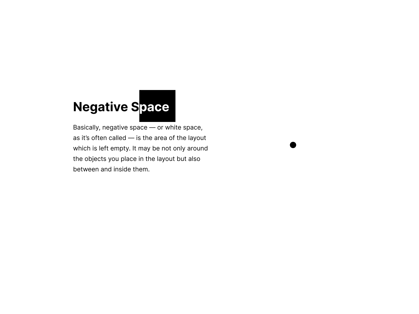
When one talks about negative space, it is essential first to define it. Negative space, or white space, is the area surrounding and between the subjects of an image or design. It is an intentional void, a canvas on which the focal points of attention can flourish. Consider it the silence in a poem—while the words carry the meaning, it’s the pauses that allow each line to resonate. Used effectively, negative space can cultivate clarity, foster comprehension, and guide the viewer’s journey through a digital landscape.
Understanding the role of negative space begins with the fundamental principles of design: balance, contrast, emphasis, movement, pattern, repetition, and unity. These principles can be likened to the foundational notes of a musical scale, each playing its part in creating harmony within a UI. Let’s take a closer look at how negative space manifests through these principles.
Balance in UI design is a delicate act, reminiscent of a tightrope walker maintaining equilibrium. Negative space contributes to both visual and functional balance; it can be employed to distribute elements evenly across a layout, helping to prevent any particular area from overwhelming the viewer. For instance, an interface laden with content needs strategically placed voids to breathe, ensuring that users are not engulfed by a deluge of information. This balance can facilitate decision-making, allowing users to absorb data and make choices without cognitive fatigue.
Moving onto contrast, this principle serves as an anchor in the sea of negative space. By juxtaposing filled elements against voids, designers can elevate the significance of individual components. Picture a gallery: a vibrant artwork glows against a stark white wall, drawing the eye and invoking emotion. In UI design, utilizing contrast through negative space can highlight buttons, text, and images, thus amplifying their visibility and inviting interaction.
When we consider emphasis, negative space becomes a remarkable tool for directing attention. It manages the viewer’s gaze, showcasing the most pivotal elements of a design. Think of an advertisement that employs a simplistic layout with a bold call-to-action button. The surrounding space propels this button into the spotlight, ensuring that it cannot be overlooked. This deliberate separation allows for an enhanced user journey, as the design guides the viewer systematically, akin to a shepherd guiding their flock.
Movement, in design terms, addresses the trajectory of the user’s interaction with the interface. Negative space cleverly orchestrates this flow, allowing the eye to transition seamlessly from one element to another. Clean lines, ample spacing, and well-placed voids create an unconditional pathway, drawing users from one point of interest to the next. This fluidity not only enriches the aesthetic appeal but also elevates the overall usability, turning the user experience into an engaging narrative.
Patterns and repetition are pivotal in establishing recognition and coherence. Negative space enhances patterns by creating a rhythm, akin to the beats in music. When elements are spaced uniformly, they create a comforting predictability that communicates organization and professionalism. This consistency cultivates a relationship of trust between the user and the interface, allowing for a more enjoyable experience that encourages exploration.
Finally, unity must be addressed, as this principle is the summation of all others. Negative space collaborates with each design component to create a cohesive narrative. A well-executed design that respects the principles of balance, contrast, emphasis, movement, pattern, and repetition will undoubtedly resonate as a unified entity. Users are captivated by designs that present a clear message and aesthetic harmony—where every detail has its purpose, and the negative space is revered as an integral element, not an afterthought.
In practical application, integrating negative space into UI design translates into a plethora of possibilities. Here are some invaluable techniques that harness the power of negative space:
- Whitespace Utilization: Ensure ample space around interface elements. Both the separation of content and the strategic use of margins can significantly enhance legibility.
- Focus on Typography: Choose typographic elements that complement negative space. By selecting a clean font and allowing generous line spacing, you create an interface that is easy on the eyes.
- Image Integration: When using images, allow the background to breathe. Avoid cramming visuals into a small area; instead, let the image exist alongside ample white space, allowing it to resonate.
- Responsive Design: Negative space must adapt fluidly across different devices. Ensure that elements remain adequately spaced whether viewed on a desktop, tablet, or mobile device.
- Visual Hierarchy: Utilize negative space to establish a hierarchy among elements. A larger margin around significant buttons or headings can signify their importance and draw actionable attention.
In conclusion, the thoughtful application of negative space can transform a cluttered interface into a sanctuary of clarity and focus. Designing with intentionality, where balance and harmony reign supreme, leads to interfaces that not only captivate but also facilitate an intuitive user experience. Just as a painter selects the canvas on which to create their masterpiece, designers must wield negative space judiciously, crafting an environment where each element shines through the serenity of absence. Embrace the art of negative space, and let it guide users on a seamless journey through your digital realm.


Leave a Comment