
In a world cluttered with visual noise, where every surface screams for attention, the “Less Is More” poster challenge emerges as a clarion call for clarity. This isn’t just about stripping away the superfluous—it’s about distilling the essence of an idea into a single, arresting visual that lingers in the mind long after the glance fades. Minimalist posters don’t just decorate walls; they transform spaces into sanctuaries of thought, where every line, color, and negative space serves a purpose. Imagine walking into a room where a single poster commands the entire wall, not through volume, but through its quiet authority. That’s the power of minimalism—a silent revolution in design that sells not just products, but ideas, emotions, and philosophies.
The “Less Is More” poster challenge isn’t merely a trend; it’s a testament to the enduring allure of simplicity. In an era where consumers are bombarded with stimuli, a poster that whispers rather than shouts stands out precisely because it refuses to compete. It’s the difference between a crowded marketplace and a serene garden, where each element has room to breathe. This challenge invites designers, artists, and even casual creators to rethink their approach to visual communication, proving that the most compelling messages often require the fewest words—or in this case, the fewest elements.

The Philosophy Behind Minimalist Posters: Why Less Truly Becomes More
At its core, minimalist design is rooted in the principle that simplicity amplifies impact. The “Less Is More” poster challenge distills this philosophy into a tangible exercise: create a poster that communicates its message with the fewest possible elements. This isn’t about laziness or lack of creativity—it’s about precision. Every shape, line, and color must earn its place on the canvas, contributing to the overall narrative rather than distracting from it.
Consider the Bauhaus movement, where form followed function with unrelenting discipline. Bauhaus posters didn’t just adorn walls; they distilled complex ideas into geometric purity. The same principle applies today. A minimalist poster might use a single bold line to evoke movement, or a stark contrast of black and white to convey tension. The absence of clutter isn’t a void—it’s an invitation for the viewer to engage more deeply with what remains.
This philosophy extends beyond aesthetics. Minimalist posters often carry a sense of timelessness. Unlike trends that fade with the seasons, simplicity endures. A poster designed today with restraint will still feel relevant decades from now, its message as clear as the day it was created. In a world of disposable design, that’s a radical act of defiance.
Breaking Down the “Less Is More” Poster: Key Elements That Sell
Creating a minimalist poster that sells—whether it’s for a product, an event, or an abstract concept—requires a deep understanding of visual hierarchy and emotional resonance. Here’s how the best minimalist posters achieve their magic:
The Power of Negative Space
Negative space isn’t empty space—it’s the unsung hero of minimalist design. It’s the quiet pause between musical notes, the breath before a sprint. In a poster, negative space can shape the viewer’s perception, guiding their eyes to the focal point with surgical precision. Take, for example, a poster where a single word floats in a sea of white. The emptiness isn’t a lack of content; it’s a deliberate choice to let the word breathe, to make it unforgettable.
Typography as a Visual Statement
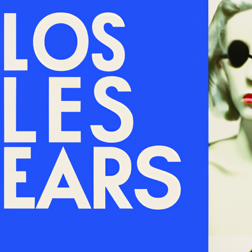
In minimalist posters, typography isn’t just about readability—it’s about personality. A single word, rendered in a bold, unconventional font, can convey an entire mood. Think of a poster for a poetry reading where the word “Whisper” is typeset in a delicate, handwritten script. The choice of font alone tells a story before the viewer even processes the text. The key is to select typefaces that align with the poster’s emotional tone, whether it’s authoritative, playful, or serene.
Color: The Subtle Language of Emotion
Minimalist posters often rely on a limited color palette to evoke specific feelings. A poster for a meditation retreat might use soft, muted tones to suggest calm, while a poster for a punk concert could employ stark black and red to convey energy. The trick is to use color sparingly but strategically. A single accent color against a monochrome background can create a focal point that draws the eye instantly. The absence of color can be just as powerful—consider the impact of a poster rendered entirely in grayscale, where every shade of gray carries weight.
The Art of Omission: What to Leave Out
The most challenging part of the “Less Is More” challenge is deciding what to exclude. Every element must justify its existence. Does the poster need a border? Probably not. Does it need a logo? Only if the logo itself is a work of art. The goal is to strip away anything that doesn’t serve the core message. This process of elimination forces designers to think critically about their work, resulting in posters that are not just visually striking, but conceptually profound.
Case Studies: Minimalist Posters That Redefined Their Genres
To truly grasp the potential of minimalist posters, it’s helpful to examine real-world examples where simplicity led to iconic design. These posters didn’t just meet the brief—they redefined what a poster could be.
The Bauhaus Poster: Geometry as a Universal Language
The Bauhaus movement’s posters are masterclasses in minimalism. Take the work of Josef Müller-Brockmann, whose posters for the Zurich Tonhalle are a study in precision. Using only geometric shapes, bold typography, and a restrained color palette, Müller-Brockmann created posters that communicated complex musical programs with effortless clarity. The viewer doesn’t need to know German to understand the essence of the event—it’s all there in the visual language.
The Swiss Style Poster: Precision in Every Pixel
Swiss design, with its emphasis on grid systems and sans-serif typography, took minimalism to another level. Posters from this tradition, like those by Josef Müller-Brockmann or Armin Hofmann, are paragons of order. They prove that a poster doesn’t need to be loud to be effective. Instead, it can be a symphony of alignment, contrast, and proportion, where every element is meticulously placed to create harmony.
The Modern Minimalist Poster: Selling Ideas, Not Just Products
Today, minimalist posters aren’t confined to art movements or historical styles. They’re used to sell everything from indie films to sustainable fashion. Consider the poster for the film “Her,” which features a single, solitary figure against a gradient background. The simplicity of the design mirrors the film’s themes of isolation and connection, making the poster a visual extension of the story. Similarly, posters for eco-conscious brands often use natural materials and earthy tones to convey their message, letting the product speak for itself through its absence of excess.
How to Master the “Less Is More” Poster Challenge: A Step-by-Step Guide
Ready to take on the challenge? Here’s a step-by-step guide to creating a minimalist poster that sells, whether you’re a seasoned designer or a first-time creator.
Step 1: Define Your Core Message
Before you touch a design tool, ask yourself: What is the single most important thing this poster needs to communicate? Is it the name of an event? The launch of a product? A philosophical idea? Boil your message down to its essence. If you can’t summarize it in one sentence, you’re not ready to design.
Step 2: Sketch with Intention
Grab a pencil and paper. Sketching forces you to think in broad strokes before diving into details. Play with composition, typography, and negative space. Don’t worry about perfection—focus on exploring possibilities. The goal is to find the most direct visual path to your message.
Step 3: Limit Your Color Palette
Choose a palette of no more than three colors. If you’re feeling bold, go monochrome. The fewer colors you use, the stronger your poster’s visual impact will be. Remember, each color should serve a purpose—whether it’s to highlight, contrast, or evoke emotion.
Step 4: Embrace the Power of Typography
Select a font that aligns with your message. A serif font might convey tradition and elegance, while a sans-serif font could feel modern and approachable. If you’re using multiple typefaces, limit yourself to two—one for headlines, one for body text. And always, always prioritize readability.
Step 5: Use Negative Space as a Tool
Negative space isn’t just empty canvas—it’s an active design element. Use it to frame your focal point, create balance, or guide the viewer’s eye. A well-placed gap can be as powerful as a bold graphic.
Step 6: Test for Impact
Print your poster (or view it on a large screen) and step back. Does it still communicate your message from a distance? Does it feel balanced? Does it evoke the emotion you intended? If not, go back to the drawing board. Minimalism demands ruthless editing.
The Psychological Appeal of Minimalist Posters: Why We’re Drawn to Simplicity
There’s a reason minimalist posters resonate so deeply with us. Our brains are wired to seek patterns and meaning, and simplicity provides the clearest path to both. When a poster is stripped of distractions, the viewer’s brain can process its message more efficiently, leading to stronger emotional connections and better recall.
Minimalist design also taps into our desire for order in a chaotic world. In an age of information overload, a poster that offers clarity feels like a breath of fresh air. It’s no wonder that minimalist posters are often associated with luxury, sophistication, and thoughtfulness—qualities that consumers crave.
Moreover, minimalist posters have a democratic appeal. They don’t rely on flashy graphics or expensive materials to make an impact. A single, well-placed line can be just as powerful as a complex illustration. This accessibility makes minimalism a powerful tool for creators on any budget.
Common Pitfalls to Avoid in Minimalist Poster Design
While the “Less Is More” challenge is liberating, it’s not without its traps. Here are a few mistakes to watch out for:
Over-Reliance on Trends
Minimalism isn’t a trend—it’s a timeless approach. Don’t fall into the trap of using minimalist design just because it’s popular. Every element should serve a purpose, not just follow a style.
Sacrificing Readability for Aesthetics
Just because a poster is minimal doesn’t mean it should be unreadable. If your typography is so stylized that no one can decipher the text, you’ve failed. Always prioritize clarity over cleverness.

Ignoring the Context
A minimalist poster that works in a gallery might not translate to a busy street corner. Consider where your poster will be displayed and adjust your design accordingly. A poster for a subway station, for example, needs to be legible from a distance, while a poster for a gallery can afford to be more abstract.
Beyond the Poster: How Minimalism Influences Broader Design Trends
The principles of the “Less Is More” challenge extend far beyond posters. Minimalism has seeped into every corner of design, from branding to architecture to digital interfaces. Brands like Apple and Muji have built empires on the idea that less is more, proving that simplicity isn’t just a style—it’s a business strategy.
In digital design, minimalist interfaces reduce cognitive load, making apps and websites more user-friendly. In branding, minimalist logos—think Nike’s swoosh or Apple’s apple—are instantly recognizable and adaptable across mediums. The “Less Is More” ethos is a guiding light for designers who want to create work that’s both beautiful and functional.
Even in our personal spaces, minimalism has taken root. The rise of “quiet luxury” in fashion and interiors reflects a collective yearning for simplicity in a world that’s anything but simple. Minimalist posters are just one manifestation of this larger cultural shift—a shift toward intentionality, clarity, and meaning.
The Future of Minimalist Posters: Where Do We Go From Here?
As design continues to evolve, so too will the “Less Is More” challenge. Emerging technologies like augmented reality and generative AI are opening new frontiers for minimalist design. Imagine a poster that changes subtly based on the viewer’s perspective, or one that incorporates interactive elements without cluttering the visual field. The future of minimalism isn’t about doing less—it’s about doing more with less.
We’re also seeing a growing appreciation for handcrafted minimalism. In a world dominated by digital perfection, there’s something deeply human about a poster that bears the marks of its creation—a slight asymmetry in a hand-drawn line, a texture in the paper. These imperfections add warmth and authenticity, reminding us that minimalism isn’t about cold perfection, but about distilled essence.
Ultimately, the “Less Is More” poster challenge is more than a design exercise—it’s a philosophy. It’s a call to strip away the unnecessary, to focus on what truly matters, and to communicate with clarity and conviction. In a world that often feels overwhelming, minimalist posters offer a moment of respite, a visual sigh of relief. They remind us that sometimes, the most powerful messages are the ones that don’t need to shout to be heard.
So go ahead. Take the challenge. Create a poster that doesn’t just fill a wall, but transforms it. Create a poster that doesn’t just sell a product, but sells an idea. Create a poster that doesn’t just catch the eye, but captures the soul. The canvas is waiting. What will you leave out?


Leave a Comment