

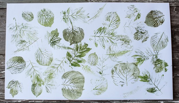
There’s a quiet magic in the way light can transform ordinary objects into something extraordinary. When leaves and lace converge under the right conditions, they don’t just create shadows—they weave stories. Photogram-style screen prints capture this alchemy, turning the ephemeral into the tangible. Whether you’re a seasoned printmaker or a curious beginner, the fusion of organic textures and delicate patterns offers endless creative possibilities. This guide explores how to harness these elements to craft prints that feel both nostalgic and fresh, bridging the gap between nature and artistry.
The Allure of Photogram-Style Prints: Why Leaves and Lace?
Photograms, a technique rooted in early photography, rely on placing objects directly onto light-sensitive paper to create silhouettes. But why choose leaves and lace? Leaves bring an unscripted, organic asymmetry—each vein and edge tells a different story. Their translucency allows light to dance through their forms, creating gradients that lace simply cannot replicate. Meanwhile, lace introduces a paradox: its rigid patterns contrast sharply with the fluidity of leaves, yet when combined, they produce a harmonious tension. Together, they transform the mundane into the mesmerizing, turning a simple screen print into a tactile narrative.
The interplay between these materials isn’t just visual; it’s tactile. The rough edges of dried leaves against the smooth, almost skeletal structure of lace create a dialogue between texture and delicacy. This duality invites viewers to not just see the print but to feel its layers—literally and metaphorically. For artists, this means an opportunity to explore themes of growth, decay, and the delicate balance between structure and spontaneity.
Gathering Your Materials: A Curated Selection
Before diving into the process, assembling the right materials is crucial. Start with leaves—fresh or dried, but always flat. Pressed leaves work best for crisp, clean lines, while slightly curled ones add a dreamlike quality. Choose a variety of shapes: maple for bold, jagged edges; ferns for delicate, feathery details; or even eucalyptus for their silvery, ghostly hues. Lace, on the other hand, should be fine and intricate. Vintage lace, with its yellowed edges and uneven stitches, adds a layer of history, while modern, geometric lace introduces a contemporary edge.
You’ll also need:
- Light-sensitive emulsion for screen printing, which reacts to UV light.
- A screen (preferably mesh count between 110-160 for detailed work).
- A exposure unit or a strong UV light source, like a sunlamp or even direct sunlight.
- Screen degreaser and emulsion remover for cleanup.
- A squeegee and printing ink (water-based or solvent-based, depending on your preference).
Don’t overlook the importance of a clean workspace. Dust and debris can mar your prints, so work in a controlled environment. If possible, use a darkroom or a space where you can control light exposure during the emulsion process.
Preparing Your Design: From Nature to Stencil
The beauty of photogram-style prints lies in their spontaneity, but a little planning goes a long way. Start by arranging your leaves and lace on a transparent sheet or directly on the screen (if using a contact method). Experiment with compositions—overlapping leaves create depth, while lace can be layered to form intricate borders or focal points. For a more controlled approach, sketch your design first, then transfer it to the screen using a stencil or by blocking out areas with tape.
If you’re working with fresh leaves, press them between heavy books for a few days to flatten them. Dried leaves, while more brittle, can be brittle, so handle them with care. For lace, iron it flat if necessary, but avoid excessive heat that might melt synthetic fibers. The goal is to create a composition that feels balanced yet dynamic—where no single element overpowers the others.
Consider the negative space as much as the positive. The gaps between leaves and lace can become as compelling as the objects themselves, especially when ink bleeds into these voids during printing. Think of your design as a conversation between presence and absence, where every shadow and highlight contributes to the final narrative.
The Emulsion Process: Capturing Light and Shadow
Applying emulsion to your screen is where the magic begins. Mix the emulsion according to the manufacturer’s instructions, then coat your screen evenly using a scoop coater. For photogram-style prints, a thin, even layer is ideal—thick emulsion can obscure fine details. Allow the screen to dry in a dark, dust-free environment. The key here is patience; rushing this step can lead to uneven exposure and muddy prints.
Once dry, place your leaf and lace arrangement on the screen. Secure it with weights or tape to prevent shifting. Now, expose the screen to UV light. The duration depends on your light source—typically 10-30 minutes for sunlight, longer for weaker lamps. The emulsion will harden where light hits it, while the areas blocked by leaves and lace remain soluble. After exposure, rinse the screen with water. The unexposed emulsion will wash away, leaving behind a stencil that mirrors your design.
Test your screen with a few prints before committing to a full run. Adjust exposure time or rinse duration if the details aren’t crisp. Remember, the goal is to capture the essence of your materials, not to replicate them with clinical precision. Embrace the imperfections—the slight blurring of a leaf’s edge or the unevenness of lace can add character to your prints.
Printing Techniques: Layering and Experimentation
With your screen ready, it’s time to print. Start with a clean surface—paper, fabric, or even wood panels work well. Use a squeegee to pull ink across the screen, applying even pressure. The first pull should be slow and deliberate, allowing the ink to seep into the stencil. For multi-layered prints, let each layer dry completely before adding the next. This builds depth and complexity, turning a simple print into a visual symphony.
Experiment with ink colors. Earthy tones like ochre and umber complement the natural hues of leaves, while metallic inks can highlight the intricate patterns of lace. For a more organic feel, mix your own inks using pigments derived from plants or minerals. Transparent inks work particularly well, as they allow the layers beneath to peek through, creating a sense of depth.
Don’t shy away from unconventional substrates. While paper is traditional, fabric—especially linen or cotton—absorbs ink beautifully, lending a soft, tactile quality to the print. Wood panels can add a rustic charm, especially if you distress the surface beforehand. Each material interacts with the ink differently, so take the time to explore how your design translates across various surfaces.
Finishing Touches: Sealing and Preserving Your Art
Once your prints are dry, consider how to preserve them. For paper prints, a fixative spray can prevent smudging and fading, especially if you’re using water-based inks. For fabric, heat-setting the ink with an iron or a heat press ensures longevity. If you’ve printed on wood, a clear varnish or beeswax finish can protect the surface while enhancing the natural grain.
Framing is another opportunity to elevate your work. Float frames, where the print sits slightly above the backing, create a sense of depth. Alternatively, a simple matte can draw attention to the intricate details of your design. For fabric prints, consider stretching them over a wooden frame or sewing them into a pillow or wall hanging for a functional piece of art.
Document your process. Photograph each step—from the initial leaf arrangement to the final print. These images can serve as a visual diary of your creative journey, and they might even inspire future projects. Plus, sharing your process online can connect you with a community of artists who appreciate the intersection of nature and printmaking.
Inspiration and Beyond: Pushing the Boundaries
The fusion of leaves and lace in photogram-style prints is just the beginning. Once you’ve mastered the basics, challenge yourself to explore new materials. Try incorporating dried flowers, feathers, or even rusted metal for a more industrial aesthetic. Combine screen printing with other techniques, like cyanotype or digital manipulation, to create hybrid artworks that defy categorization.
Consider the thematic potential of your work. Leaves and lace can symbolize growth and fragility, tradition and innovation. They can evoke the passage of time, the beauty of decay, or the resilience of nature. Let these themes guide your compositions, and don’t be afraid to imbue your prints with personal meaning. Art is, after all, a conversation between the artist and the viewer—and every leaf, every stitch of lace, is a word in that dialogue.

The world is brimming with textures and patterns waiting to be discovered. Leaves and lace are merely the starting point—a reminder that beauty often lies in the interplay between the organic and the crafted. So gather your materials, embrace the unpredictability, and let the light do the rest. Your next masterpiece might just be a shadow away.


Leave a Comment