

In the grand ballet of interior design, rules are less like ironclad laws and more like whispered suggestions from a well-meaning but slightly outdated aunt. The pros? They waltz right past them, twirling through spaces with the confidence of someone who knows that beauty isn’t about obedience—it’s about audacity. These are the designers who turn “never mix metals” into a dare, who laugh in the face of “matchy-matchy,” and who treat “less is more” like a suggestion rather than a commandment. If you’ve ever felt stifled by the rigid dictates of traditional decor, it’s time to meet the rebels who are redefining what it means to curate a home. Here are 10 interior design rules the pros break on purpose—and why you should too.
The Myth of “Matchy-Matchy” and the Art of Controlled Chaos
There’s a seductive comfort in symmetry, in pairing identical lamps on either side of a sofa or lining up a row of identical throw pillows like soldiers at attention. But the pros? They see it as a missed opportunity. Instead, they embrace “controlled chaos,” a philosophy where mismatched patterns, clashing textures, and unexpected pairings create a symphony of visual intrigue. Think of it like a jazz improvisation—each piece, though different, contributes to a harmonious whole. A velvet emerald armchair might sit beside a sleek, modern glass coffee table, while a geometric rug anchors the space with its bold lines. The result? A room that feels alive, dynamic, and deeply personal. The key isn’t to abandon cohesion entirely but to let it emerge organically from a place of confidence rather than fear.
Breaking the “Never Mix Metals” Rule: The Alchemy of Alloy
For decades, the golden rule of interior design was simple: stick to one metal finish per room, or risk looking like a hardware store exploded. But the pros have long since ditched this limitation, opting instead for the alchemy of alloy—a deliberate mixing of brass, chrome, gold, and blackened steel to create a space that feels rich, layered, and effortlessly cool. The trick lies in balance. A brass chandelier might hang over a steel dining table, while gold cabinet pulls add a whisper of luxury to a matte black kitchen. The result is a room that feels curated, not coincidental. Metals, after all, are the jewelry of a space; why wear just one ring when you can stack them?
Ditching “Neutral Palettes” for a Symphony of Color
Neutrals are the safe bet, the beige security blanket of interior design. But the pros? They treat color like a spice rack—essential, but far more exciting when used with abandon. A room doesn’t have to be a monochrome sanctuary to feel sophisticated. In fact, the most striking spaces often embrace a riot of hues, from jewel-toned walls to furniture in unexpected shades like terracotta or teal. The secret is in the layering: start with a bold statement piece—a velvet sofa in deep plum, perhaps—and build outward with smaller doses of color in textiles, art, and decor. The result is a room that feels like a celebration, not a waiting room.

The “Less is More” Lie: Why Maximalism is the New Minimalism
“Less is more” has been the mantra of minimalism for decades, but the pros are flipping the script. Maximalism isn’t about clutter—it’s about abundance, about filling a space with objects that tell a story. A maximalist room might feature a gallery wall of eclectic art, a bookshelf bursting with books and trinkets, or a sofa piled high with throw blankets in every texture imaginable. The key is intention. Every piece should have meaning, whether it’s a vintage lamp that belonged to a grandparent or a quirky sculpture that sparks joy. The result is a room that feels like a treasure trove, where every corner holds a surprise.
Ignoring “Scale and Proportion” to Create Drama
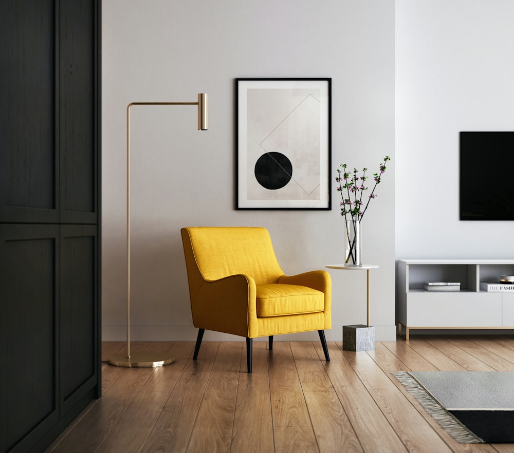
Proportion is the backbone of good design, but the pros know that breaking it can create some of the most dramatic and memorable spaces. A petite side table might stand beside a towering floor lamp, or a massive sectional sofa might dominate a room with high ceilings, leaving plenty of breathing room. The trick is to play with scale in a way that feels intentional. A tiny chair in a vast room can create a sense of intimacy, while an oversized mirror can make a small space feel grand. The result is a room that feels dynamic, almost theatrical, as if it’s staging a performance.
The “Don’t Block the View” Rule: Framing the World
Windows are the eyes of a home, offering glimpses of the world outside. But the pros often treat them like canvases, using heavy drapes or floor-to-ceiling bookshelves to frame the view rather than obscure it. A grand window might be dressed in sheer curtains that filter the light like a watercolor wash, or a living room might feature a built-in shelf that doubles as a room divider, allowing the view to remain unobstructed. The result is a space that feels connected to the outside world, as if the boundaries between indoors and outdoors have blurred.

Breaking the “No Clutter” Rule: The Beauty of Lived-In Spaces
Clean lines and tidy surfaces have their place, but the pros know that a truly inviting home often tells the story of its inhabitants. A coffee table might be strewn with books, a kitchen counter might hold a bowl of fresh fruit and a stack of mail, and a bedroom might feature a rumpled duvet and a pile of shoes by the door. The key is to embrace the messiness of life while keeping it intentional. A bowl of lemons on the counter isn’t clutter—it’s a celebration of color and freshness. The result is a room that feels lived-in, loved, and deeply human.
The “Match Your Floors to Your Walls” Fallacy
Matching floors to walls is the interior design equivalent of wearing a belt that matches your shoes—it’s safe, but it lacks personality. The pros often break this rule by playing with contrast, pairing dark wood floors with light walls or vice versa. The result is a space that feels balanced yet unexpected. A room with white walls and dark hardwood floors might feel grounded and sophisticated, while a space with light floors and dark walls could feel airy and modern. The trick is to let the materials speak for themselves, using color and texture to create depth and interest.
Ditching the “No Art Above the Sofa” Dictate
Hanging art above a sofa is a classic move, but the pros know that rules are made to be bent. A gallery wall might stretch across an entire wall, or a single oversized piece might hang above a console table instead. The key is to play with scale and placement. A small piece of art might sit on a side table, while a large sculpture commands attention in a corner. The result is a room that feels curated, not cookie-cutter, with art that tells a story rather than just filling space.
Interior design isn’t about following a rulebook—it’s about creating a space that feels like an extension of yourself. The pros break the rules because they know that beauty isn’t found in obedience, but in the courage to defy expectations. So go ahead, mix your metals, clash your patterns, and fill your home with color and texture. After all, the most memorable spaces aren’t the ones that play it safe—they’re the ones that dare to be different.


Leave a Comment