

The allure of a flawlessly curated portfolio presentation is undeniable. It’s the silent handshake between creator and audience, the unspoken promise of skill and vision. Yet, beneath the polished surfaces of fashion designers’ portfolios lies a trove of strategic brilliance—subtle cues, deliberate layouts, and psychological triggers that elevate their work from mere images to unforgettable narratives. If you’ve ever found yourself captivated by a designer’s presentation, only to wonder, *How did they do that?*—you’re not alone. The truth is, those ideas aren’t just born from raw talent; they’re meticulously crafted, borrowed, and adapted. Stealing portfolio presentation ideas from fashion designers isn’t about plagiarism; it’s about reverse-engineering brilliance to elevate your own work. Here’s how to decode their secrets without a single stitch of guilt.
The Psychology of First Impressions: Why Portfolio Presentations Command Attention
Before a single word is read, a portfolio’s visual language speaks volumes. Fashion designers understand this implicitly—they don’t just display garments; they curate experiences. The human brain processes visuals 60,000 times faster than text, and a well-structured portfolio exploits this primal wiring. The opening spread, for instance, isn’t arbitrary; it’s a calculated first impression designed to evoke curiosity or admiration. A monochromatic palette might whisper sophistication, while a bold, asymmetrical layout screams avant-garde. These choices aren’t accidental. They’re rooted in cognitive psychology, leveraging the halo effect—where one striking element (a striking image, a unique font) casts a favorable glow over the entire presentation. To steal this idea, start by analyzing the emotional tone of your favorite designer’s portfolio. Is it playful? Minimalist? Darkly romantic? Mimic the mood, not the content, and watch how your audience’s perception shifts.

Narrative Threads: Weaving Stories into Static Pages
Fashion portfolios aren’t just collections of pretty pictures—they’re visual stories. Designers often structure their presentations like a runway show, with a clear beginning, middle, and end. The opening might introduce a theme (e.g., “Urban Nomad”), the middle explores variations (fabric swatches, color palettes), and the finale delivers a knockout piece (the showstopper garment). This narrative arc isn’t just for runway shows; it’s a powerful tool for any portfolio. To adapt this, ask yourself: What’s the overarching story of your work? Is it a journey of evolution, a rebellion against convention, or a celebration of craftsmanship? Use section headers as chapter titles, and let each spread build on the last. Even if your work isn’t fashion-related, this technique can transform a static portfolio into an immersive experience. Think of it as visual storytelling—where every image, caption, and white space plays a role in the plot.
The Power of Negative Space: Less Is More (But Only If Done Right)
In a world cluttered with overstimulated visuals, negative space isn’t just emptiness—it’s a deliberate statement. Fashion designers often use it to highlight a single, breathtaking piece, letting it breathe amid a sea of white or black. This technique isn’t just about aesthetics; it’s about control. By isolating an image, you force the viewer to focus, to linger, to *feel*. Take a cue from designers who use negative space to create tension—like a model poised in a vast, empty room, or a single jewel-toned accessory against a muted backdrop. To apply this, audit your portfolio for clutter. Are there spreads where too many images compete for attention? Strip it down. Leave room for the eye to rest. Remember, negative space isn’t wasted space; it’s the canvas that makes the art pop.
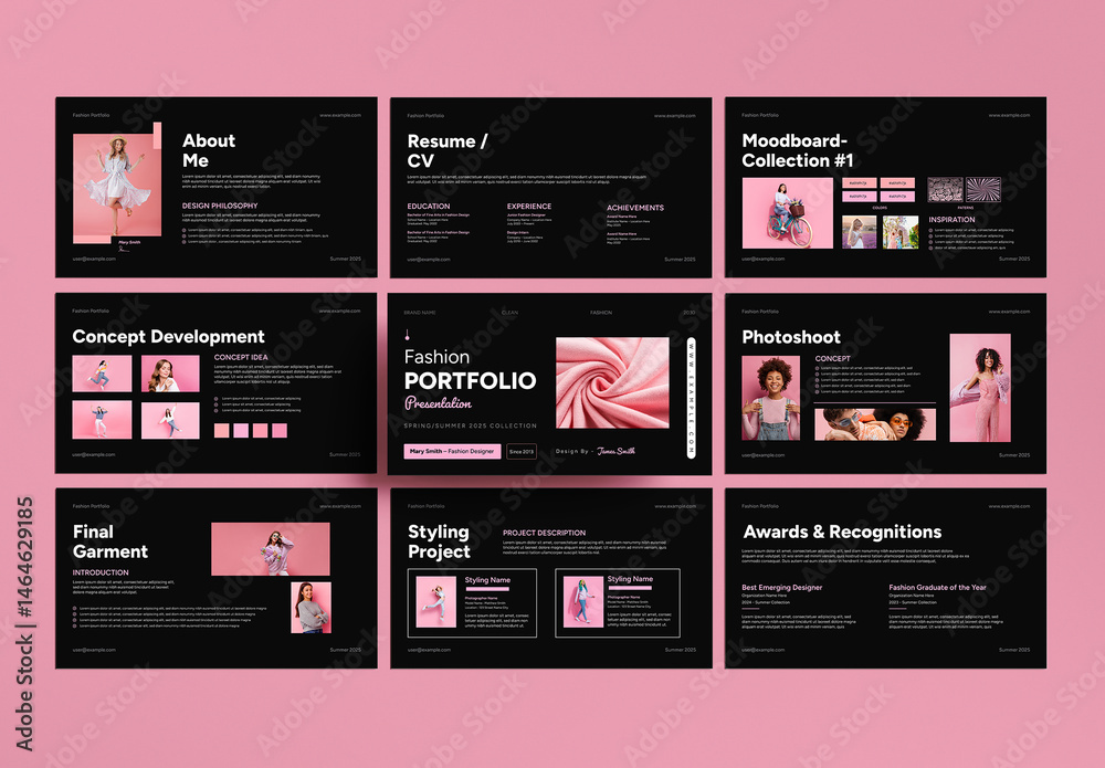
Typography as Texture: Fonts That Speak Volumes
Fonts aren’t just letters—they’re textures, emotions, and personalities. A serif font might evoke timeless elegance, while a bold sans-serif screams modernity. Fashion designers often pair fonts with the same precision as they do fabrics, using typography to reinforce their brand’s voice. For example, a portfolio for a luxury brand might use a delicate script for captions, while a streetwear line opts for a gritty, industrial typeface. To steal this idea, treat your typography like a signature. If your work is playful, choose a whimsical font. If it’s corporate, go for clean, professional lines. But here’s the catch: don’t overdo it. Stick to two fonts max—one for headings, one for body text—and use size, weight, and color to create hierarchy. Typography isn’t just about readability; it’s about creating a mood.
The Art of the Tease: Hints and Half-Truths
Great portfolio presentations don’t reveal everything at once—they tease. Designers often use partial shots, cropped images, or blurred backgrounds to spark curiosity. A sleeve peeking out from the edge of a page, a shadowy figure in the distance—these aren’t accidents. They’re deliberate provocations, designed to make the viewer lean in, to wonder, to *need* to see more. To apply this, think about what you’re not showing. Are there works-in-progress you could hint at? Behind-the-scenes shots that add depth? Even a small, mysterious detail can turn a static portfolio into an interactive experience. The key is restraint. Tease just enough to intrigue, but not so much that the viewer feels cheated.
Consistency as Currency: The Unspoken Rule of Cohesion
Fashion designers obsess over consistency—not just in their garments, but in every visual element of their portfolio. The same color palette, the same font, the same photographic style—these aren’t arbitrary choices. They’re the threads that weave a cohesive narrative. A portfolio that jumps from vintage to futuristic, from pastel to neon, risks feeling scattered, unprofessional. To steal this idea, audit your portfolio for visual chaos. Are your images edited with the same filters? Do your colors complement each other? Even small details, like the way you frame your shots or the tone of your captions, should align with your overarching aesthetic. Consistency isn’t about being boring; it’s about being memorable for the right reasons.
The Grand Finale: Leaving Them Wanting More
Every great portfolio ends with a crescendo—a final image, a quote, a call-to-action that lingers in the viewer’s mind. Fashion designers often save their most striking piece for last, ensuring the audience leaves with a lasting impression. But the finale isn’t just about the work; it’s about the *feeling*. A well-placed testimonial, a bold mission statement, or even a simple “Thank You” can elevate a portfolio from impressive to unforgettable. To steal this idea, think about what you want your audience to remember. Is it your innovation? Your dedication? Your unique perspective? Craft a finale that reinforces that message. And don’t underestimate the power of silence—sometimes, the most impactful ending is a single, uncluttered spread that lets your work speak for itself.
The magic of a fashion designer’s portfolio isn’t in the garments alone—it’s in the meticulous choreography of visuals, narrative, and psychology. By borrowing these techniques, you’re not copying; you’re learning from the masters. The goal isn’t to replicate their work, but to adapt their strategies to your own voice. So go ahead. Steal their ideas. Refine them. Make them your own. Because the best portfolios aren’t just seen—they’re *felt*. And that’s a language anyone can learn.


Leave a Comment