

The first time I held a printed photograph in my hands, I was struck by a paradox: the image on paper felt lifeless compared to the vibrant glow of my screen. Colors that popped with intensity in Lightroom or Photoshop now appeared muted, as if drained of their vitality. This dissonance isn’t just a quirk of printing—it’s a fundamental clash between two worlds: the digital and the physical. The culprit? A concept known as *gamut*, the invisible boundary that dictates how colors translate from one medium to another. Understanding this invisible force is the first step toward bridging the gap between your screen and your prints, ensuring that what you envision is what you ultimately hold in your hands.
But how do you navigate this complex interplay of light, ink, and perception? The answer lies in a technique called soft proofing, a digital rehearsal that lets you preview how your image will appear in print before committing to paper. It’s like a backstage pass to the final performance, allowing you to tweak colors, adjust contrast, and even anticipate potential pitfalls before they manifest on your printer. Whether you’re a seasoned photographer or a hobbyist dipping your toes into the world of print, mastering soft proofing and gamut warnings can transform your workflow from guesswork to precision.
The Gamut: The Invisible Wall Between Screen and Print
Imagine a vast, invisible canvas where every color imaginable exists. This is the *gamut*—the complete range of colors a device can reproduce. Screens, with their backlit pixels, boast a gamut that’s often wider than that of printers, which rely on inks and substrates to mimic hues. This discrepancy is why a neon green on your monitor might render as a dull olive on paper. The issue isn’t your printer; it’s the fundamental difference in how light and ink interact with our eyes.
Gamut warnings, those pesky little exclamation marks or highlighted areas in your editing software, are your first clue that a color is about to betray you. They’re not just alerts—they’re a map of the digital frontier, showing you where your image’s colors exceed the printer’s capabilities. Ignoring them is like sailing into uncharted waters without a compass. The result? Prints that feel flat, lifeless, or worse, entirely different from your original vision.
Soft Proofing: Your Digital Crystal Ball
Soft proofing is the art of simulating print output on your screen, allowing you to see potential issues before they happen. It’s not magic—it’s calibration, patience, and a deep understanding of your printer’s limitations. Most modern editing software, from Adobe Lightroom to Capture One, includes soft proofing tools. These tools let you load a printer profile, which describes how your specific printer, paper, and ink combination reproduces colors. Without this profile, you’re essentially flying blind.
The process begins with selecting the right profile. Not all printer profiles are created equal. A profile for glossy paper will differ dramatically from one for matte, just as a profile for a high-end inkjet won’t match that of a budget-friendly laser printer. Once applied, the soft proofing view will highlight out-of-gamut colors, often in a neon or desaturated overlay. This is your cue to adjust. You might reduce saturation, shift hues, or even embrace the limitations of your printer’s gamut, crafting an image that feels intentional rather than compromised.

Choosing the Right Profile: The Unsung Hero of Print Quality
Printer profiles are the unsung heroes of the printing world. They’re not just files you download and forget—they’re living documents that evolve with your equipment, inks, and papers. Generic profiles, often provided by manufacturers, are a starting point, but they’re rarely optimized for your specific setup. For true precision, consider creating custom profiles using a spectrophotometer and profiling software like X-Rite’s i1Profiler or Datacolor’s SpyderPRINT. This process involves printing a test chart, measuring it with the spectrophotometer, and generating a profile that tells your software exactly how your printer behaves.
But what if custom profiling isn’t an option? Start with the manufacturer’s profile for your paper type. Test prints are your best friend here. Print a small section of your image on the same paper you plan to use for the final piece. Compare it side by side with your soft-proofed version. Does the print match your expectations? If not, tweak your edits and try again. This iterative process, though time-consuming, is the only way to ensure consistency and accuracy in your prints.
Beyond Gamut: The Psychology of Color Perception
Even with perfect soft proofing, the human eye can deceive. Our perception of color is influenced by countless factors: ambient lighting, the color of the room, even our mood. A print that looks vibrant under warm tungsten light might appear dull under cool fluorescent lighting. This is why professional print labs often include a color-accurate viewing booth in their workflow—a tool to ensure that what you see is what the customer will see.
Consider the *metamerism* effect, where colors appear to change under different light sources. A print that looks perfect in your studio might shift dramatically when viewed in a client’s home. Soft proofing can’t account for this entirely, but it can help you anticipate potential issues. For critical prints, such as fine art or commercial work, always request a proof print before committing to a large run. This small step can save you from costly mistakes and ensure your work is presented as intended.
Practical Workflow: From Screen to Print Without the Guesswork
Let’s distill this into a step-by-step workflow that you can integrate into your editing process:
- Start with the End in Mind: Before you edit, decide on your paper type and printer. This informs your initial choices in saturation, contrast, and color temperature.
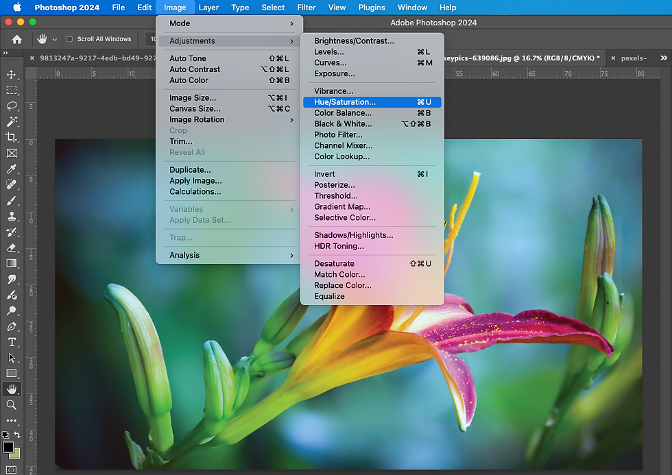
- Enable Soft Proofing: In your editing software, load the appropriate printer profile and enable soft proofing. Toggle between the original and proofed view to spot discrepancies.
- Adjust Strategically: Use the soft proofing overlay to identify out-of-gamut colors. Shift hues toward the printer’s gamut, reduce saturation where necessary, and consider converting to a print-specific color space like Adobe RGB or ProPhoto RGB if your workflow allows.
- Test and Refine: Print a small test section. Compare it to your soft-proofed image under the same lighting conditions you’ll use for final viewing. Make adjustments based on the test print.
- Finalize and Print: Once satisfied, export your image with the printer profile embedded. Print at the highest quality settings, using the same paper and ink you tested with.
The Emotional Impact of Accurate Prints
There’s an intangible magic to holding a print that faithfully represents your vision. It’s not just about technical accuracy—it’s about the emotional resonance of your work. A landscape that feels alive on screen should feel equally vibrant on paper. A portrait that captures the subtle hues of skin tones should translate seamlessly to the physical medium. When prints match your screen, you’re not just producing images; you’re creating experiences.
Conversely, a print that falls short of expectations can feel like a betrayal. The colors you loved become dull, the details you cherished fade into obscurity. Soft proofing and gamut awareness are your shields against this disappointment. They’re the difference between a print that feels like a rough draft and one that feels like a masterpiece.
Common Pitfalls and How to Avoid Them
Even with the best intentions, it’s easy to stumble. One common mistake is relying solely on generic profiles. These profiles are designed for average use, not for the nuances of your specific setup. Another pitfall is ignoring the paper’s texture. Glossy papers reflect light differently than matte, affecting how colors appear. Always match your soft proofing profile to the exact paper you’ll use.
Over-editing is another trap. It’s tempting to push saturation and contrast to compensate for the printer’s limitations, but this often leads to prints that feel unnatural. Instead, aim for a balance—let the printer’s gamut guide your adjustments, and trust that subtlety often yields the most compelling results.
The Future of Printing: Where Technology Meets Artistry
The world of printing is evolving rapidly. New technologies, like OLED screens and advanced inkjet systems, are pushing the boundaries of gamut and color accuracy. Meanwhile, AI-driven profiling tools are making custom color management more accessible than ever. Yet, at its core, printing remains an art form—a blend of science and intuition.
As you refine your skills in soft proofing and gamut management, remember that the goal isn’t perfection. It’s about creating prints that resonate, that tell a story, and that stand the test of time. Whether you’re printing for a gallery, a client, or yourself, the principles remain the same: understand your tools, respect the limitations, and let your vision guide the process.
The next time you hold a print in your hands, let it be a testament to your mastery—not just of your camera or your editing software, but of the entire creative journey from screen to paper. The colors will align. The details will sing. And the magic of print will come alive.


Leave a Comment