

Have you ever stood back from your watercolor painting, only to be met with a disheartening murkiness—a dull, lifeless haze where vibrant hues once danced? That, my fellow artist, is the dreaded specter of muddy watercolors. It’s the silent thief of brilliance, the uninvited guest that turns your carefully layered washes into a soupy, indistinguishable mess. But what if I told you that mud isn’t a flaw in your technique—it’s a clue? A signpost pointing toward a deeper understanding of color theory, water control, and the alchemy of pigments. Let’s embark on a journey to demystify this phenomenon and reclaim the luminosity your work deserves.
Imagine, for a moment, that your palette is a symphony orchestra. Each pigment is an instrument, and your brush is the conductor. When every note is played in harmony, the result is breathtaking. But introduce too many conflicting melodies, and the cacophony is inevitable. Muddy watercolors are the visual equivalent of that discord—a result of colors clashing, overmixing, or losing their individual voices. The good news? With the right knowledge, you can transform this chaos into a masterpiece of clarity and vibrancy.
The Alchemy of Color: Why Mud is Born from Good Intentions
At the heart of muddy watercolors lies a fundamental truth: color mixing is a science wrapped in an art. When you blend complementary colors—those opposites on the color wheel, like red and green or blue and orange—you’re not just creating a new shade. You’re neutralizing each other, stripping away their brilliance until all that remains is a dull, lifeless gray or brown. It’s not that these colors are “bad”; it’s that they’re too powerful when united. The key isn’t to avoid them entirely but to wield them with intention.
Consider the humble primary colors: red, blue, and yellow. These are the building blocks of your palette, but they’re also the most volatile. Mix two primaries, and you get a secondary color—vibrant and full of life. But add a third? Suddenly, you’re in the realm of tertiary hues, where the risk of muddiness skyrockets. The more colors you introduce, the more their individual personalities fade into a beige or gray abyss. This is why seasoned watercolorists often limit their palette to a few carefully chosen pigments. Fewer colors mean fewer opportunities for discord.
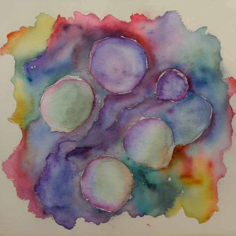
But here’s the twist: mud isn’t always the enemy. Sometimes, it’s a tool. Artists like Joseph Zbukvic and Alvaro Castagnet use controlled mud to create atmospheric depth, particularly in shadows and textured surfaces. The difference lies in intention. Mud created by accident is a sign of lost control; mud created deliberately is a stroke of genius. The challenge is learning to distinguish between the two—and that starts with understanding your pigments.
Pigment Power: The Hidden Culprits Behind Muddy Washes
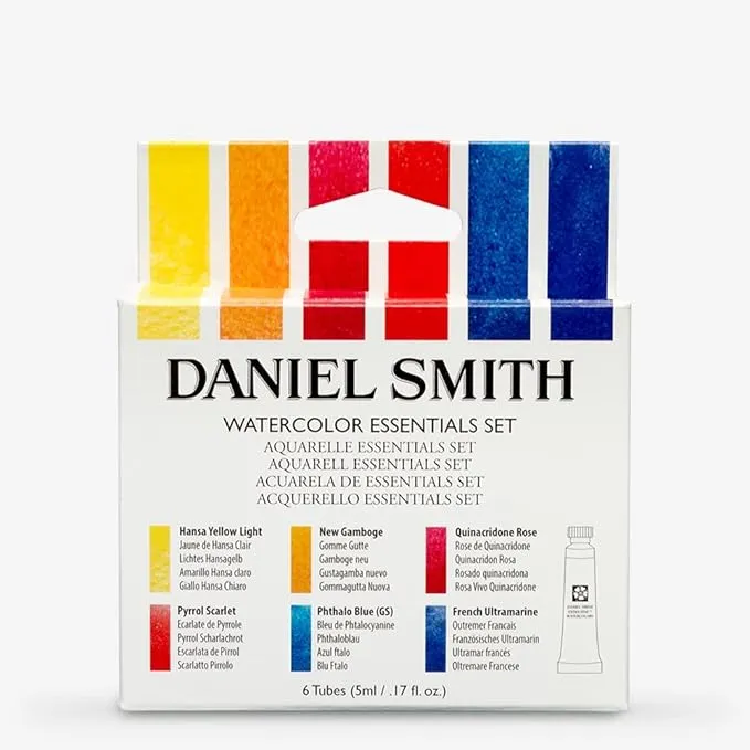
Not all pigments are created equal. Some are inherently prone to muddiness, while others remain luminous even when pushed to their limits. The culprit? Often, it’s the pigments themselves. For instance, many student-grade paints contain fillers or dyes that lack the transparency and intensity of professional-grade pigments. These fillers can cloud your colors, turning what should be a bright cerulean into a murky sludge. Investing in high-quality, single-pigment paints can make a world of difference. Brands like Daniel Smith, Winsor & Newton, and Holbein are renowned for their vibrant, lightfast pigments that resist muddiness.
Another factor is the granulating nature of certain pigments. Granulation occurs when pigments settle into the paper’s texture, creating a speckled, uneven appearance. While this can add texture and depth, it can also contribute to a lack of clarity if overused. For example, Ultramarine Blue and Burnt Sienna are notorious granulating pigments. When mixed with other granulating colors, they can create a visual static that dulls the overall effect. To combat this, try pairing granulating pigments with smoother, more transparent ones, like Phthalo Blue or Quinacridone Gold. This balance can help maintain the integrity of your colors while adding texture where desired.
The paper you choose also plays a role in the muddiness equation. Rough-textured papers can exacerbate granulation, while smooth papers may make it harder to achieve the subtle variations that add depth. Hot-pressed paper, with its smooth surface, is ideal for detailed work and vibrant colors, while cold-pressed paper offers a middle ground with enough texture to add interest without overwhelming your washes. Experiment with different papers to find the one that best complements your style and pigments.
The Waterfall Effect: How Too Much H2O Drowns Your Colors
Water is the lifeblood of watercolor, but it’s also its most unpredictable variable. Too little water, and your pigments clump into unworkable globs. Too much, and they dissolve into a watery soup, losing their vibrancy and clarity. The “waterfall effect” is a term I use to describe the moment when excess water dilutes your colors beyond recognition, leaving behind a weak, anemic wash. This often happens when artists overwork their paintings, constantly re-wetting areas to blend or adjust colors. Each time you add water, you’re diluting the pigments further, pushing them closer to the edge of muddiness.
To avoid this, think of water as a tool, not a crutch. Use it deliberately to lift color, create gradients, or soften edges, but resist the urge to over-saturate your paper. One technique to master is the “wet-on-wet” approach, where you apply water to your paper before adding pigment. This allows the colors to spread and blend organically, creating soft, luminous transitions. However, be mindful of the amount of water you use. A little goes a long way, and too much can lead to uncontrolled blooms and muddy washes.
Another culprit is the dreaded “over-glazing.” This occurs when you layer multiple washes on top of each other, each one slightly more diluted than the last. While glazing can create depth and luminosity, it can also lead to a buildup of pigment that muddies your colors. To prevent this, allow each layer to dry completely before adding the next. Patience is key. Rushing the process often results in a muddy, overworked mess. Instead, embrace the layers. Each one should build on the last, adding richness and complexity without overwhelming the composition.
The Palette Paradox: Less Can Be Astonishingly More
It’s tempting to fill your palette with every color imaginable, especially when you’re just starting out. But more colors don’t necessarily mean more possibilities—they often mean more mud. The palette paradox is the idea that limiting your color choices can actually expand your creative potential. By restricting yourself to a curated selection of pigments, you force yourself to think more critically about mixing and layering. This not only reduces the risk of muddiness but also encourages a deeper understanding of color relationships.
Start with a limited palette of three primary colors—one warm and one cool version of each primary. For example, a warm red (like Cadmium Red), a cool red (like Permanent Alizarin Crimson), a warm blue (like Ultramarine Blue), a cool blue (like Phthalo Blue), a warm yellow (like Cadmium Yellow), and a cool yellow (like Lemon Yellow). This gives you six pigments to work with, but the combinations are nearly endless. By mixing these carefully, you can create a full spectrum of colors without ever introducing the muddying effects of too many pigments.
Another strategy is to use a “split-primary” palette. This involves selecting two reds, two blues, and two yellows, each with distinct temperature characteristics. For instance, you might choose a warm red (Cadmium Red) and a cool red (Quinacridone Red), a warm blue (Ultramarine Blue) and a cool blue (Phthalo Blue), and a warm yellow (Cadmium Yellow) and a cool yellow (Aureolin). This palette allows you to mix a wide range of hues while maintaining control over the temperature and intensity of your colors. The result? Vibrant, harmonious mixes that resist the pull of muddiness.
Brushwork and Beyond: The Subtle Art of Control
Your brush is an extension of your hand, but it’s also a gateway to muddiness if not wielded with care. The type of brush you use, the pressure you apply, and the way you handle it all play a role in the final outcome of your painting. For example, synthetic brushes with springy bristles can hold more water, making them ideal for washes and broad strokes. However, they can also lead to over-saturation if you’re not careful. Natural hair brushes, like those made from sable or squirrel, offer more control and precision, but they require a lighter touch to avoid overworking the paint.
The way you load your brush also matters. Too much pigment, and your strokes will appear heavy and opaque. Too little, and they’ll lack vibrancy. Aim for a balance—enough pigment to create a rich, saturated stroke, but not so much that it overwhelms the paper. When applying color, use confident, deliberate strokes. Hesitation leads to over-blending, which can muddy your edges and lose the crispness of your initial washes. Think of your brushwork as a dance: fluid, controlled, and full of intention.
Don’t forget the role of negative space and the power of leaving areas untouched. Mud often arises when artists try to fill every inch of the paper, fearing empty space. But sometimes, the most striking effects come from what you choose not to paint. Let the white of the paper shine through in highlights, or leave areas of the background unpainted to create a sense of light and airiness. This not only reduces the risk of muddiness but also adds a dynamic contrast to your composition.
The Final Revelation: Embracing the Mud to Find the Magic
Here’s the secret no one tells you: mud isn’t the end of your painting—it’s the beginning of a deeper understanding. Every muddy wash is a lesson in disguise. It teaches you about the limits of your pigments, the importance of water control, and the delicate balance of color theory. Instead of seeing mud as a failure, reframe it as feedback. Ask yourself: What went wrong? Was it the pigments? The mixing? The water? The paper? Once you identify the culprit, you can adjust your approach and try again.
Remember, even the most celebrated watercolorists have faced the mud monster. Winsor & Newton’s founder, William Winsor, once said, “Watercolor is the art of controlled accidents.” The key word here is “controlled.” Accidents will happen, but it’s your job to guide them toward brilliance. Embrace the process of experimentation. Keep a sketchbook dedicated to testing pigments, mixing colors, and pushing the boundaries of what’s possible. Over time, you’ll develop an intuitive sense of which combinations work and which don’t. You’ll learn to trust your instincts and make decisions with confidence.
And when you finally stand back from a painting that glows with luminosity—where every color sings in harmony, and the light dances across the surface—you’ll realize that the journey through the mud was worth every step. Because the magic of watercolor isn’t in avoiding mistakes. It’s in transforming them into something extraordinary.
So go ahead. Pick up your brush. Embrace the mud. And let your colors shine.


Leave a Comment